We sometimes face the problem that our python code is NOT as fast as we expect. This article introduces a really simple method to fast our python code.
The author also introduces several new features in the following articles.
The techniques to reduce the dimensionality of a dataset are important because we can understand a dataset visually. Principal component analysis(PCA) is known as one of the most famous techniques. However, t-SNE is also might be a good choice because this technique can reflect the nonlinearity than that of PCA.
LightGBM, one of the decision-tree-method libraries, is known as the faster library. This article demonstrates features of how to facilitate computational speed.
The author also introduces several new features in the following articles.
PyCaret 2.3.5 is the biggest release of PyCaret. New features are dashboard, EDA, converting model, fairness, web API, creating Dockerfile for web API, Web App, monitoring data drift, optimizing threshold for classification, and new documentation.
The author also introduces several new features in the following articles.
In this post, we will learn how to build a docker container for PyCaret.
We create a docker image from a Dockerfile. And, we will see how to build a docker container and run a jupyterlab.
Dockerfile
The entire contents of the Dockerfile are as follows.
FROM python:3.8

WORKDIR /opt
RUN pip install --upgrade pip
RUN pip install pycaret \
				jupyterlab
RUN pip install lux-api
RUN jupyter nbextension install --py luxwidget
RUN jupyter nbextension enable --py luxwidget
WORKDIR /work

CMD ["jupyter","lab","--ip=0.0.0.0","--allow-root","--LabApp.token=''"]
We create the docker image based on the python image, whose version is 3.8.
By the sentence “WORKDIR /opt”, we specify the directory for installing the python libraries.
And, we upgrade pip, to install the external python libraries in order. Here, we install pycaret and jupyterlab. Of course, you can also install other libraries.
Note that the last sentence ‘WORKDIR /work’ indicates that the current directory is set at ‘/work/’ after we enter the docker container.
Build a Dockerfile
Let’s create a docker image from the Dockerfile. Execute the following command in the directory where the Dockerfile exists.
$ docker build .
After building the docker image, you can confirm the result by the following command. Later, we will use the ‘IMAGE ID’.
$ docker images
Run a docker container
Here, we run the docker container from the above docker image. The command format is as follows.
$ docker run -it -p 8888:8888 -v ~/mounted_to_docker/:/work (IMAGE ID)
'-p 8888:8888':
-> Allows the port, whose number is 8888, in a docker container

'-v ~/mounted_to_docker/:/work':
->Synchronizes the local directory you specified('~/mounted_to_docker/') with the directory in the container('/work').
When the docker container was successfully running, you can access a jupyterlab in your web browser. The URL appears in your terminal.
Your local directory ‘~/mounted_to_docker/’ is mounted to the working directory ‘/work’ in the container.
Congratulation!! You have prepared the environment for PyCaret.
PyCaret is a useful auto ML python library because we can deploy machine learning models with low codes. We can also perform preprocessing, compare models, and tune hyperparameters, of course with low codes.
Recently, PyCaret version 2.3.6 was released. This is big news because several new wonderful functions were implemented in this release version! The details are described in this article written by PyCaret creator.
In this article, we will check the summary of this release. And, the three new features will be introduced.
New Features
Dashboard: interactive dashborad for a trained model.
EDA: Explonatory Data Analysis
Convert Model: converting a trained model from python into other programing language, such as C, Java, Go, JavaScript, Visual Basic, C#, PowerShell, R, PHP, Dart, Haskell, Ruby, F#.
As seeing the above new feature list, PyCaret is evolving dramatically!
In the following, we will introduce some of the new functions using normal regression analysis as an example.
Installation
If you have NOT installed PyCaret yet, you can easily install it by the following command. Note that specify the PyCaret version!
$pip install pycaret==2.3.6
From here, the sample code in this post is supposed to run on Jupyter Notebook.
Import Libraries
In advance, we load all the modules for regression analysis of PyCaret.
from pycaret.regression import *
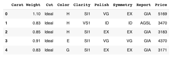
Dataset
We use the diamond dataset for regression analysis.
# load dataset
from pycaret.datasets import get_data

df = get_data('diamond')
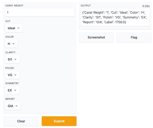
Set up the environment by the “setup()” function
PyCaret needs to initialize an environment by the “setup()” function. Conveniently, PyCaret infers the data type of the variables in the dataset.
Arguments of setup() are the dataset as Pandas DataFrame, the target-column name, and the “session_id”. The “session_id” equals a random seed.
s = setup(df, target='Price', session_id = 20220121)
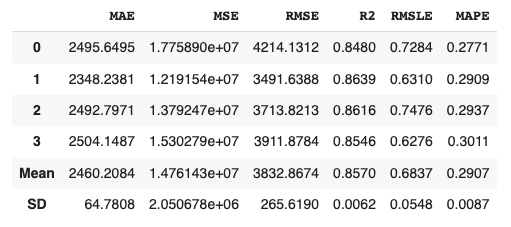
Create a Model
Due to the simplicity of the technique and the interpretability of the model, we will adopt lr(Linear Regression) for the models that will be used below.
We can create the selected model by create_model() with the argument of “lr”. Another argument of “fold” is the number of cross-validation. “fold = 4” indicates we split the dataset into four and train the model in each dataset separately.
lr = create_model("lr", fold=4)
Introduction of New Features of PyCaret 2.3.6
From here, we will introduce two of the new features.
Convert model
With this new function, we can convert a trained model into another language, e. g. from python to C. This function is very useful when operating the created model.
Note that we need to install the dependency libraries.
PyCaret is a useful auto ML python library because we can deploy machine learning models with low codes. We can also perform preprocessing, compare models, and tune hyperparameters, of course with low codes.
Recently, PyCaret version 2.3.6 was released. This is big news because several new wonderful functions were implemented in this release version! The details are described in this article written by PyCaret creator.
In this article, we will check the summary of this release. And, the three new features will be introduced.
New Features
Dashboard: interactive dashborad for a trained model.
EDA: Explonatory Data Analysis
Convert Model: converting a trained model from python into other programing language, such as C, Java, Go, JavaScript, Visual Basic, C#, PowerShell, R, PHP, Dart, Haskell, Ruby, F#.
As seeing the above new feature list, PyCaret is evolving dramatically!
In the following, we will introduce some of the new functions using normal regression analysis as an example.
Installation
If you have NOT installed PyCaret yet, you can easily install it by the following command. Note that specify the PyCaret version!
$pip install pycaret==2.3.6
From here, the sample code in this post is supposed to run on Jupyter Notebook.
Import Libraries
In advance, we load all the modules for regression analysis of PyCaret.
from pycaret.regression import *
Dataset
We use the diamond dataset for regression analysis.
# load dataset
from pycaret.datasets import get_data

df = get_data('diamond')
Set up the environment by the “setup()” function
PyCaret needs to initialize an environment by the “setup()” function. Conveniently, PyCaret infers the data type of the variables in the dataset.
Arguments of setup() are the dataset as Pandas DataFrame, the target-column name, and the “session_id”. The “session_id” equals a random seed.
s = setup(df, target='Price', session_id = 20220121)
Create a Model
Due to the simplicity of the technique and the interpretability of the model, we will adopt lr(Linear Regression) for the models that will be used below.
We can create the selected model by create_model() with the argument of “lr”. Another argument of “fold” is the number of cross-validation. “fold = 4” indicates we split the dataset into four and train the model in each dataset separately.
lr = create_model("lr", fold=4)
Introduction of New Features of PyCaret 2.3.6
From here, we will introduce two of the new features.
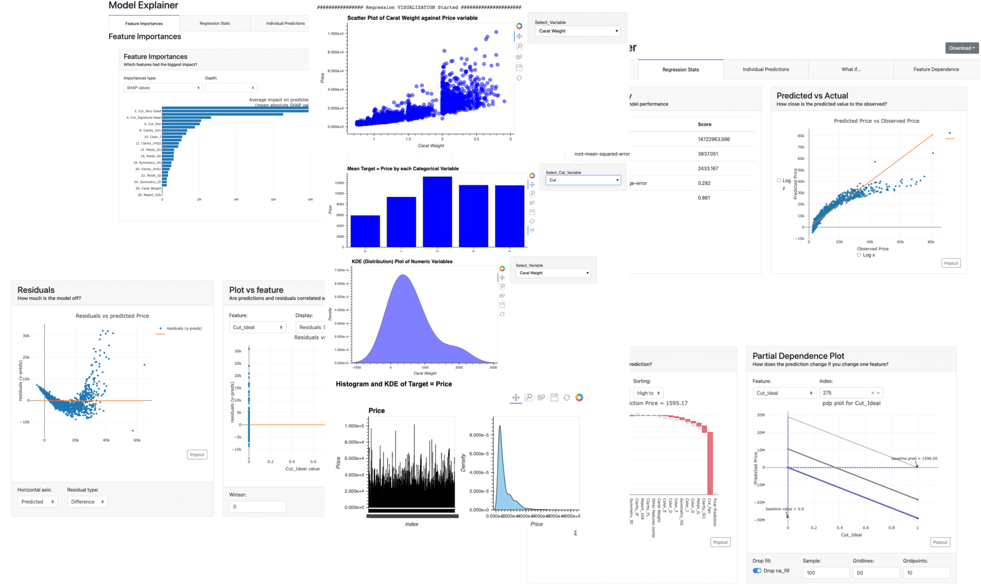
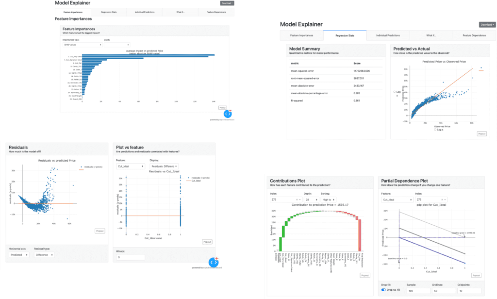
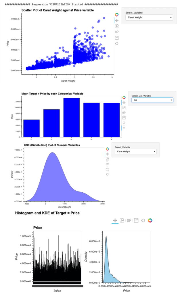
Dashboard
With this new function, we can create a dashboard for a trained model.
The dashboard function is implemented by ExplainerDashboard, we need the “explainerdashboard” library. We can install it with the pip command.
$pip install explainerdashboard
Then, we can create a dashboard.
dashboard(model)
Parts of the dashboard screen are introduced in the figure below.
EDA(Exploratory Data Analysis)
This new function requires the “autoviz” library.
$pip install autoviz
Just 1 line code. We can perform the EDA.
eda()
Summary
We have seen the new features of PyCaret 2.3.6.
In this article, we saw the Dashboard and EDA function.
Just 1 line.
We can create a dashboard and perform the EDA of a trained model. Wouldn’t it be great? If you sympathize with it, please give it a try.
The author hopes this blog helps readers a little.
The recommended articles the author has read this week.
The topic this week is SHAP. This indicator is useful to evaluate the trained model, even if the model is a black box. As follows, the materials for learning are listed.
In this article, several important graph styles are introduced with easy descriptions. With the above official Github repository, you will get a deeper understanding of SHAP.
This article is written about basic contents of Python, but informative. Many people may use the “os” module, however, it is also practical to use the “Pathlib” module.
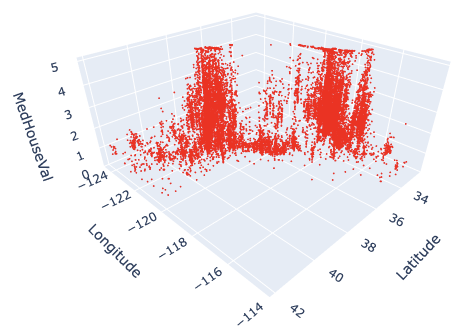
3D visualization is practical because we can understand relationships between variables in a dataset. For example, when EDA (Exploratory Data Analysis), it is a powerful tool to examine a dataset from various approaches.
For visualizing the 3D scatter, we use Plotly, the famous python open-source library. Although Plotly has so rich functions, it is a little bit difficult for a beginner. Compared to the famous python libraries matplotlib and seaborn, it is often not intuitive. For example, not only do object-oriented types appear in interfaces, but we often face them when we pass arguments as dictionary types.
Therefore, In this post, the basic skills for 3D visualization for Plotly are introduced. We can learn the basic functions required for drawing a graph through a simple example.
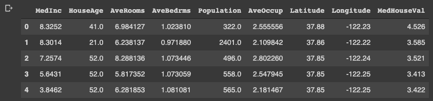
In this post, we use the “California Housing dataset” included in scikit-learn.
# Get a dataset instance
dataset = fetch_california_housing()
The “dataset” variable is an instance of the dataset. It stores several kinds of information, i.e., the explanatory-variable values, the target-variable values, the names of the explanatory variable, and the name of the target variable.
We can take and assign them separately as follows.
dataset.data: values of the explanatory variables dataset.target: values of the target variable (house prices) dataset.feature_names: the column names
Note that we store the dataset as pandas DataFrame because it is convenient to manipulate data. And, the target variable “MedHouseVal” indicates the median house value for California districts, expressed in hundreds of thousands of dollars ($100,000).
# Store the dataset as pandas DataFrame
df = pd.DataFrame(dataset.data)
# Asign the explanatory-variable names
df.columns = dataset.feature_names
# Asign the target-variable name
df[dataset.target_names[0]] = dataset.target

df.head()
Variables to be used in each axis
Here, we prepare the variables to be used in each axis. Here, we use “Latitude” and “Longitude” for the x- and y-axis. And for the z-axis, we use “MedHouseVal”, the target variable.
xlbl = 'Latitude'
ylbl = 'Longitude'
zlbl = 'MedHouseVal'

x = df[xlbl]
y = df[ylbl]
z = df[zlbl]
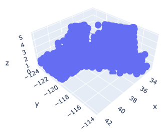
Basic Format for 3D Scatter
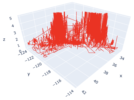
To get started, let’s create a 3D scatter figure. We use the “graph_objects()” module in Plotly. First, we creaete a graph instance as “fig”. Next, we add a 3D Scatter created by “go.Scatter3d()” to “fig” by the “go.add_traces()” module. Finally, we can visualize by “fig.show()”.
# import plotly.graph_objects as go

# Create a graph instance
fig = go.Figure()
# Add 3D Scatter to the graph instance
fig.add_traces(go.Scatter3d(
    x=x, y=y, z=z,
))
# Show the figure
fig.show()
However, you can see that the default settings are often inadequate.
Therefore, we will make changes to the following items to create a good-looking graph.
Marker size
Marker color
Plot Style
Axis label
Figure size
Save a figure as a HTML file
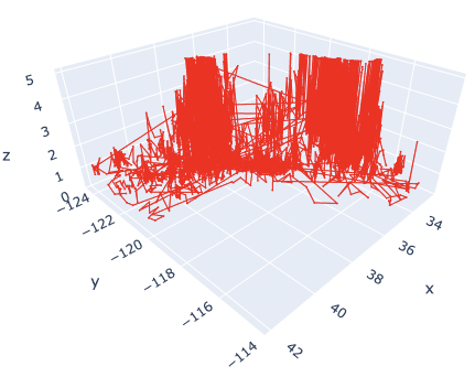
Marker size and color
We change the marker size and color. Note that we have to pass the argument as dictionary type.
# Create a graph instance
fig = go.Figure()
# Add 3D Scatter to the graph instance
fig.add_traces(go.Scatter3d(
    x=x, y=y, z=z,
    # marker size and color
    marker=dict(color='red', size=1),
))
# Show the figure
fig.show()
The marker size has been changed from 3 to 1. And, the color has also been changed from blue to red.
Here, by reducing the marker size, we can see that not only points but also lines are mixed. To make a point-only graph, you need to explicitly specify “Marker” in the mode argument.
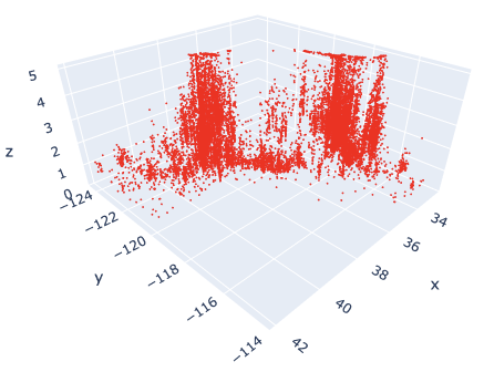
Marker Style
We can easily specify as marker style.
# Create a graph instance
fig = go.Figure()
# Add 3D Scatter to the graph instance
fig.add_traces(go.Scatter3d(
    x=x, y=y, z=z,
    # marker size and color
    marker=dict(color='red', size=1),
    # marker style
    mode='markers',
))
# Show the figure
fig.show()
Of course, you can easily change the line style. Just change the “mode” argument from “markers” to “lines”.
Axis Label
Next, we add the label to each axis.
While we frequently create axis labels, Plotly is less intuitive than matplotlib. Therefore, it will be convenient to check it once here.
We use the “go.update_layout()” module for changing the figure layout. And, as an argument, we pass the “scene” as a dictionary, where we pass each axis label as dictionary value to its key.
# Create a graph instance
fig = go.Figure()
# Add 3D Scatter to the graph instance
fig.add_traces(go.Scatter3d(
    x=x, y=y, z=z,
    # marker size and color
    marker=dict(color='red', size=1),
    # marker style
    mode='markers',
))
# Axis Labels
fig.update_layout(
    scene=dict(
        xaxis_title=xlbl,
        yaxis_title=ylbl,
        zaxis_title=zlbl,
        )
    )
# Show the figure
fig.show()
Figure Size
We sometimes face the situation to change the figure size. It can be easily performed just one line by the “go.update_layout()” module.
fig.update_layout(height=600, width=600)
Save a figure as HTML format
We can save the created figure by the “go.write_html()” module.
fig.write_html('3d_scatter.html')
Since the figure is created and saved as an HTML file, we can confirm it interactively by a web browser, e.g. Chrome and Firefox.
Cheat Sheet for 3D Scatter
# Create a graph instance
fig = go.Figure()
# Add 3D Scatter to the graph instance
fig.add_traces(go.Scatter3d(
    x=x, y=y, z=z,
    # marker size and color
    marker=dict(color='red', size=1),
    # marker style
    mode='markers',
))
# Axis Labels
fig.update_layout(
    scene=dict(
        xaxis_title=xlbl,
        yaxis_title=ylbl,
        zaxis_title=zlbl,
        )
    )
# Figure size
fig.update_layout(height=600, width=600)
# Save the figure
fig.write_html('3d_scatter.html')
# Show the figure
fig.show()
Summary
We have seen how to create the 3D scatter graph. By plotly, we can create it easily.
The author believes that the code example in this post makes it easy to understand and implement a 3D scatter graph for readers.
This time we tried with only one variable, but the case for multi variables can be implemented in the same way. We have defined hyperparameters as a dictionary, but we just need to add additional variables there.
The author hopes this blog helps readers a little.