
Visualizing the dataset is very important to understand a dataset.
However, the larger the number of explanatory variables, the more difficult it is to visualize that reflects the characteristics of the dataset. In the case of classification problems, it would be ideal to be able to classify a dataset with a small number of variables.
Principal Components Analysis(PCA) is one of the practical methods to visualize a high-dimensional dataset. This is because PCA is a technique to reduce the dimension of a dataset, i.e. aggregation of information of a dataset.
In this post, we will see how PCA can help you aggregate information and visualize the dataset. We use the wine classification dataset, one of the famous open datasets. We can easily use this dataset because it is already included in scikit-learn.
In the previous blog, exploratory data analysis(EDA) against the wine classification dataset is introduced. Therefore, you can check the detail of this dataset.
Import Library
import numpy as np
import pandas as pd
from sklearn.preprocessing import StandardScaler
from sklearn.metrics import accuracy_score
from sklearn.datasets import load_wine
from sklearn.decomposition import PCA
import plotly.graph_objects as go
Load the dataset
dataset = load_wine()Confirm the content of the dataset
The contents of the dataset are stored in the variable “dataset”. In this variable, several kinds of information are stored, i.e., the target-variable name and values, the explanatory-variable names and values, and the description of the dataset. Then, we have to take each of them separately.
dataset.target_name: the class labels of the target variable
dataset.target: values of the target variable (class label)
dataset.feature_names: the explanatory-variable names
dataset.data: the explanatory-variable values
We can take the class labels and those unique data in the target variable.
"""target-variable name"""
print(dataset.target_names)
"""target-variable values"""
print(np.unique(dataset.target))


>>  ['class_0' 'class_1' 'class_2']
>>  [0 1 2]
There are three classes in the target variables(‘class_0’ ‘class_1’ ‘class_2’). These classes correspond to [0 1 2].
In other words, the problem is classifying wine into three categories from the explanatory variables.
Prepare the dataset as DataFrame in pandas
For convenience, we convert the dataset into the Pandas DataFrame type. With the DataFrame type, we can easily manipulate the table-type dataset and perform the preprocessing.
Here, let’s put all the data together into one Pandas DataFrame “df”.
(NOTE) df is an abbreviation for data frame.
"""Prepare explanatory variable as DataFrame in pandas"""
df = pd.DataFrame(dataset.data)
df.columns = dataset.feature_names
"""Add the target variable to df"""
df["target"] = dataset.target
print(df.head())


>>     alcohol  malic_acid   ash  ...  od280/od315_of_diluted_wines  proline  target
>>  0    14.23        1.71  2.43  ...                          3.92   1065.0       0
>>  1    13.20        1.78  2.14  ...                          3.40   1050.0       0
>>  2    13.16        2.36  2.67  ...                          3.17   1185.0       0
>>  3    14.37        1.95  2.50  ...                          3.45   1480.0       0
>>  4    13.24        2.59  2.87  ...                          2.93    735.0       0
>>
>>  [5 rows x 14 columns]
In this dataset, there are 13 kinds of explanatory variables. Therefore, to visualize the dataset, we have to reduce the dimension of the dataset by PCA.
Preapare the Explanatory variables and the Target variable
First, we prepare the explanatory variables and the target variable, separately.
"""Prepare the explanatory and target variables"""
x = df.drop(columns=['target'])
y = df['target']
Standardize the Variables
Before performing PCA, we should standardize the numerical variables because the scales of variables are different. We can perform it easily by scikit-learn as follows.
"""Standardization"""
sc = StandardScaler()
x_std = sc.fit_transform(x)
The details of standardization are described in another post. If you are unfamiliar with standardization, refer to the following post.
PCA
Here, let’s perform the PCA analysis. It is easy to perform it using scikit-learn.
"""PCA: principal component analysis"""
# from sklearn.decomposition import PCA

pca = PCA(n_components=3)
x_pca = pca.fit_transform(x_std)
PCA can be done in just two lines.
The first line creates an instance to execute PCA. The argument “n_components” represents the number of principal components held by the instance. If “n_components = 3”, the instance holds the first to third principal components.
The second line executes PCA as an explanatory variable with the instance set in the first line. The return value is the result of being converted to the main component, and in this case, it contains three components.
Just in case, let’s check the shape of the obtained “x_pca”. You can see that there are 3 components and 178 data numbers.
print(x_pca.shape)

>>  (178, 3)
Visualize the dataset
Finally, we visualize the dataset. We already obtained the 3 principal components, so it is a good choice to create the 3D scatter plot. To create the 3D scatter plot, we use plotly, one of the famous python libraries.
# import plotly.graph_objects as go

"""axis-label name"""
x_lbl, y_lbl, z_lbl = 'PCA 1', 'PCA 2', 'PCA 3'
"""data at eact axis to plot"""
x_plot, y_plot, z_plot = x_pca[:,0], x_pca[:,1], x_pca[:,2]

"""Create an object for 3d scatter"""
trace1 = go.Scatter3d(
    x=x_plot, y=y_plot, z=z_plot,
    mode='markers',
    marker=dict(
        size=5,
        color=y, # distinguish the class by color
        )
)
"""Create an object for graph layout"""
fig = go.Figure(data=[trace1])
fig.update_layout(scene = dict(
                    xaxis_title = x_lbl,
                    yaxis_title = y_lbl,
                    zaxis_title = z_lbl),
                    width=700,
                    margin=dict(r=20, b=10, l=10, t=10),
                    )
fig.show()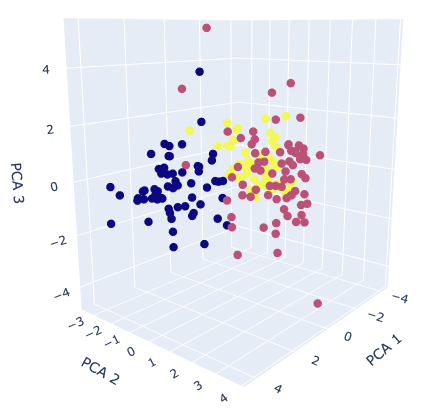
The colors correspond to the classification class. It can be seen from the graph that it is possible to roughly classify information-aggregated principal components.
If it is still difficult to classify after applying principal component analysis, the dataset may lack important features. Therefore, even if it is applied to the classification model, there is a high possibility that the accuracy will be insufficient. In this way, PCA helps us to consider the dataset by visualization.
Summary
We have seen how to perform PCA and visualize its results. One of the reasons to perform PCA is to consider the complexity of the dataset. When the PCA results are insufficient to classify, it is recommended to perform feature engineering.
The author hopes this blog helps readers a little.
You may also be interested in:
Brief EDA for Wine Classification Dataset
Standardization by scikit-learn in Python