

By streamlit, we can deploy our python script on a web app easier.
This post will see how to deploy our principal-component-analysis(PCA) code on a web app. In a web app format, we can try it in interactive. The origin of the PCA analysis in this post is introduced in another post.
Full codes are available at my GitHub repo.
From the repo, we can easily prepare an environment by docker and try streamlit.
It is easy to install streamlit by pip, just like any other Python module.
pip install streamlitRun the web app
The web app will be opened by the following command in the web browser.
$ streamlit run main.pyAppendix: Dockerfile
If you use docker, you can use the Dockerfile described below. You can try the code in this post immediately.
FROM python:3.9

WORKDIR /opt
RUN pip install --upgrade pip
RUN pip install numpy==1.21.0 \
				pandas==1.3.0 \
				scikit-learn==0.24.2 \
				plotly==5.1.0 \
				matplotlib==3.4.2 \
				seaborn==0.11.1 \
				streamlit==0.84.1

WORKDIR /work
You can build a docker container from the docker image created from the Dockerfile.
Execute the following commands.
$ docker run -it -p 8888:8888 -v ~/(your work directory):/work <Image ID> bash
$ streamlit run main.py --server.port 8888
Note that “-p 8888: 8888” is an instruction to connect the host(your local PC) with the docker container. The first and second 8888 indicate the host’s and the container’s port numbers, respectively.
Besides, by the command “streamlit run ” with the option “–server.port 8888”, we can access a web app from a web browser with the URL “localhost: 8888”.
Please refer to the details on how to execute your python and streamlit script in a docker container in the following post.
Import libraries
import streamlit as st
import numpy as np
import pandas as pd
from sklearn.preprocessing import StandardScaler
from sklearn.metrics import accuracy_score
from sklearn.datasets import load_wine
from sklearn.decomposition import PCA
import plotly.graph_objects as go
Title
You can create the title quickly by ‘st.title()’.
‘st.title()’: creates a title box
# Title
st.title('PCA applied to Wine dataset')
Load and Show the dataset
First, we load the dataset by ‘load_wine()’, and set it as pandas DataFrame by ‘pd.DataFame’.
Second, we assign the columns of the dataset and the target variable. The columns of the dataset are stored in ‘dataset.feature_names’. Similarly, the target variable is also stored in ‘dataset.target’.
Third, we show the dataset as a table-data format if we check the checkbox. The checkbox is create by ‘st.checkbox()’, and a table data is shown by ‘st.dataframe()’.
‘st.checkbox()’: creates a check box, which returns True when checked.
‘st.dataframe()’: display the data frame of the argument.
# load wine dataset
dataset = load_wine()
# Prepare explanatory variable as DataFrame in pandas
df = pd.DataFrame(dataset.data)
# Assign the names of explanatory variables
df.columns = dataset.feature_names
# Add the target variable(house prices),
# where its column name is set "target".
df["target"] = dataset.target

# Show the table data when checkbox is ON.
if st.checkbox('Show the dataset as table data'):
    st.dataframe(df)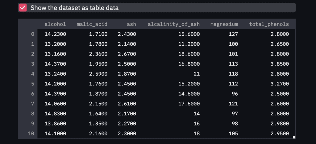
NOTE: Markdown
Here, it should be noted about ‘Markdown’, since, in the following descriptions, we will use the markdown format.
The markdown style is useful! For example, the following comment outed statement is shown in the web app as follows. With the markdown style, we can easily display the statement.
"""
# Markdown 1
## Markdown 2
### Markdown 3
"""
Standardization
Before performing the PCA, we have to perform standardization against explanatory variables.
# Prepare the explanatory and target variables
x = df.drop(columns=['target'])
y = df['target']

# Standardization
scaler = StandardScaler()
x_std = scaler.fit_transform(x)
You can refer to the details of standardization in the following post.
PCA Section
In this section, we perform the PCA and deploy it on streamlit.
We will create a design that interactively selects the number of principal components to be considered in the analysis. And, we select the principal components to be a plot.
Note that, we create these designs in the sidebar. It is easy by ‘st.sidebar’.
Number of principal components
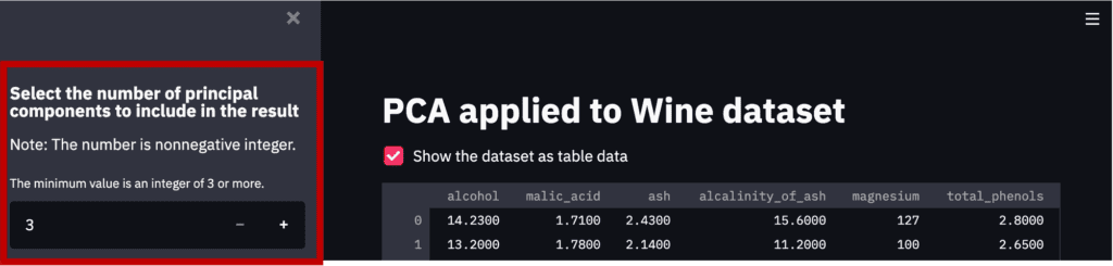
First, we will create a design that interactively selects the number of principal components to be considered in the analysis.
By “st.sidebar”, the panels are created in sidebars.
And,
‘st.number_input()’: creates a panel, where we select the number.
# Number of principal components
st.sidebar.markdown(
    r"""
    ### Select the number of principal components to include in the result
    Note: The number is nonnegative integer.
    """
    )
num_pca = st.sidebar.number_input(
                            'The minimum value is an integer of 3 or more.',
                            value=3, # default value
                            step=1,
                            min_value=3)
Note that the part created by the above code is the red frame part in the figure below.
Perform the PCA
It is easy to perform the PCA by the “sklearn.decomposition.PCA()” module in scikit-learn. We pass the number of the principal components to the argument of “n_components”.
# Perform PCA
# from sklearn.decomposition import PCA
pca = PCA(n_components=num_pca)
x_pca = pca.fit_transform(x_std)
Select the principal-component index to plot
We create the panels in the sidebar to select the principal-component index to plot. This panel in the sidebar can be created by “st.sidebar.selectbox()”.
Note that we create the description as markdown in the sidebar using “st.sidebar”.
st.sidebar.markdown(
    r"""
    ### Select the principal components to plot
    ex. Choose '1' for PCA 1
    """
    )
# Index of PCA, e.g. 1 for PCA 1, 2 for PCA 2, etc..
idx_x_pca = st.sidebar.selectbox("x axis is the principal component of ", np.arange(1, num_pca+1), 0)
idx_y_pca = st.sidebar.selectbox("y axis is the principal component of ", np.arange(1, num_pca+1), 1)
idx_z_pca = st.sidebar.selectbox("z axis is the principal component of ", np.arange(1, num_pca+1), 2)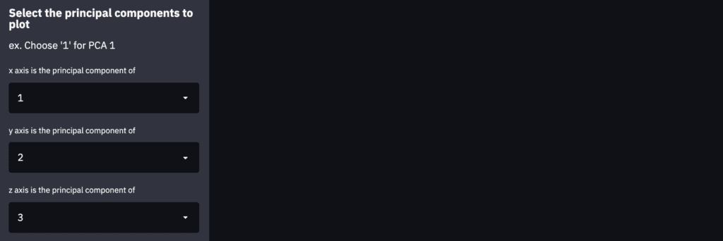
3D Plot by Plotly
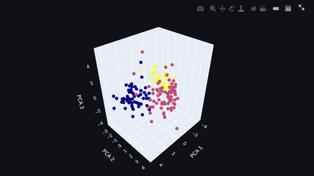
Finally, let’s visualize the PCA result as a 3D plot. We can confirm the result interactively, e.g., zoom and scroll!
First, we prepare the label of each axis and the data to plot. We have already selected the principal-component index to plot.
# Axis label
x_lbl, y_lbl, z_lbl = f"PCA {idx_x_pca}", f"PCA {idx_y_pca}", f"PCA {idx_z_pca}"
# data to plot
x_plot, y_plot, z_plot = x_pca[:,idx_x_pca-1], x_pca[:,idx_y_pca-1], x_pca[:,idx_z_pca-1]
Second, we visualize the result as a 3D plot by plotly. To visualize the result on the dashboard on Streamlit, we use the ‘st.plotly_chart()’ module, where the first argument is the graph instance created by plotly.
# Create an object for 3d scatter
trace1 = go.Scatter3d(
    x=x_plot, y=y_plot, z=z_plot,
    mode='markers',
    marker=dict(
        size=5,
        color=y,
        # colorscale='Viridis'
        )
)
# Create an object for graph layout
fig = go.Figure(data=[trace1])
fig.update_layout(scene = dict(
                    xaxis_title = x_lbl,
                    yaxis_title = y_lbl,
                    zaxis_title = z_lbl),
                    width=700,
                    margin=dict(r=20, b=10, l=10, t=10),
                    )
"""### 3d plot of the PCA result by plotly"""
# Plot on the dashboard on streamlit
st.plotly_chart(fig, use_container_width=True)
Since the graph is created as an HTML file, we can confirm it interactively.
Summary
In this post, we have seen how to deploy the PCA to a web app. I hope you experienced how easy it is to implement.
The author hopes you take advantage of Streamlit.
News: The Book has been published
The new book for a tutorial of Streamlit has been published on Amazon Kindle, which is registered in Kindle Unlimited. Any member can read it.