3D visualization is practical because we can understand relationships between variables in a dataset. For example, when EDA (Exploratory Data Analysis), it is a powerful tool to examine a dataset from various approaches.
For visualizing the 3D scatter, we use Plotly, the famous python open-source library. Although Plotly has so rich functions, it is a little bit difficult for a beginner. Compared to the famous python libraries matplotlib and seaborn, it is often not intuitive. For example, not only do object-oriented types appear in interfaces, but we often face them when we pass arguments as dictionary types.
Therefore, In this post, the basic skills for 3D visualization for Plotly are introduced. We can learn the basic functions required for drawing a graph through a simple example.
The full code is in the GitHub repository.
Import Libraries
import numpy as np
import pandas as pd
from sklearn.datasets import fetch_california_housing
import plotly.graph_objects as go
In this post, it is confirmed that the code works with the following library versions:
numpy==1.19.5
pandas==1.1.5
scikit-learn==1.0.1
plotly==4.4.1
Prepare a Dataset
In this post, we use the “California Housing dataset” included in scikit-learn.
# Get a dataset instance
dataset = fetch_california_housing()
The “dataset” variable is an instance of the dataset. It stores several kinds of information, i.e., the explanatory-variable values, the target-variable values, the names of the explanatory variable, and the name of the target variable.
We can take and assign them separately as follows.
dataset.data: values of the explanatory variables
dataset.target: values of the target variable (house prices)
dataset.feature_names: the column names
Note that we store the dataset as pandas DataFrame because it is convenient to manipulate data. And, the target variable “MedHouseVal” indicates the median house value for California districts, expressed in hundreds of thousands of dollars ($100,000).
# Store the dataset as pandas DataFrame
df = pd.DataFrame(dataset.data)
# Asign the explanatory-variable names
df.columns = dataset.feature_names
# Asign the target-variable name
df[dataset.target_names[0]] = dataset.target

df.head()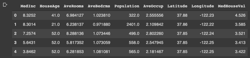
Variables to be used in each axis
Here, we prepare the variables to be used in each axis. Here, we use “Latitude” and “Longitude” for the x- and y-axis. And for the z-axis, we use “MedHouseVal”, the target variable.
xlbl = 'Latitude'
ylbl = 'Longitude'
zlbl = 'MedHouseVal'

x = df[xlbl]
y = df[ylbl]
z = df[zlbl]
Basic Format for 3D Scatter
To get started, let’s create a 3D scatter figure. We use the “graph_objects()” module in Plotly. First, we creaete a graph instance as “fig”. Next, we add a 3D Scatter created by “go.Scatter3d()” to “fig” by the “go.add_traces()” module. Finally, we can visualize by “fig.show()”.
# import plotly.graph_objects as go

# Create a graph instance
fig = go.Figure()
# Add 3D Scatter to the graph instance
fig.add_traces(go.Scatter3d(
    x=x, y=y, z=z,
))
# Show the figure
fig.show()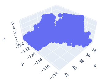
However, you can see that the default settings are often inadequate.
Therefore, we will make changes to the following items to create a good-looking graph.
- Marker size
- Marker color
- Plot Style
- Axis label
- Figure size
- Save a figure as a HTML file
Marker size and color
We change the marker size and color. Note that we have to pass the argument as dictionary type.
# Create a graph instance
fig = go.Figure()
# Add 3D Scatter to the graph instance
fig.add_traces(go.Scatter3d(
    x=x, y=y, z=z,
    # marker size and color
    marker=dict(color='red', size=1),
))
# Show the figure
fig.show()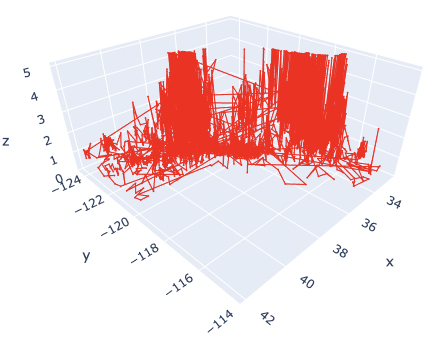
The marker size has been changed from 3 to 1. And, the color has also been changed from blue to red.
Here, by reducing the marker size, we can see that not only points but also lines are mixed. To make a point-only graph, you need to explicitly specify “Marker” in the mode argument.
Marker Style
We can easily specify as marker style.
# Create a graph instance
fig = go.Figure()
# Add 3D Scatter to the graph instance
fig.add_traces(go.Scatter3d(
    x=x, y=y, z=z,
    # marker size and color
    marker=dict(color='red', size=1),
    # marker style
    mode='markers',
))
# Show the figure
fig.show()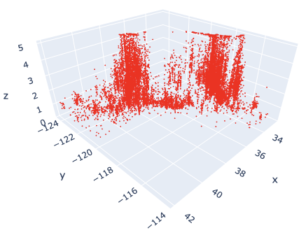
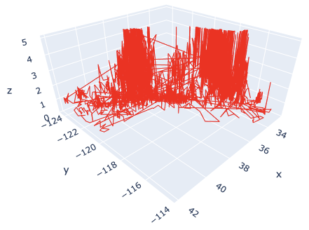
Of course, you can easily change the line style. Just change the “mode” argument from “markers” to “lines”.
Axis Label
Next, we add the label to each axis.
While we frequently create axis labels, Plotly is less intuitive than matplotlib. Therefore, it will be convenient to check it once here.
We use the “go.update_layout()” module for changing the figure layout. And, as an argument, we pass the “scene” as a dictionary, where we pass each axis label as dictionary value to its key.
# Create a graph instance
fig = go.Figure()
# Add 3D Scatter to the graph instance
fig.add_traces(go.Scatter3d(
    x=x, y=y, z=z,
    # marker size and color
    marker=dict(color='red', size=1),
    # marker style
    mode='markers',
))
# Axis Labels
fig.update_layout(
    scene=dict(
        xaxis_title=xlbl,
        yaxis_title=ylbl,
        zaxis_title=zlbl,
        )
    )
# Show the figure
fig.show()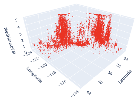
Figure Size
We sometimes face the situation to change the figure size. It can be easily performed just one line by the “go.update_layout()” module.
fig.update_layout(height=600, width=600)Save a figure as HTML format
We can save the created figure by the “go.write_html()” module.
fig.write_html('3d_scatter.html')Since the figure is created and saved as an HTML file, we can confirm it interactively by a web browser, e.g. Chrome and Firefox.
Cheat Sheet for 3D Scatter
# Create a graph instance
fig = go.Figure()
# Add 3D Scatter to the graph instance
fig.add_traces(go.Scatter3d(
    x=x, y=y, z=z,
    # marker size and color
    marker=dict(color='red', size=1),
    # marker style
    mode='markers',
))
# Axis Labels
fig.update_layout(
    scene=dict(
        xaxis_title=xlbl,
        yaxis_title=ylbl,
        zaxis_title=zlbl,
        )
    )
# Figure size
fig.update_layout(height=600, width=600)
# Save the figure
fig.write_html('3d_scatter.html')
# Show the figure
fig.show()
Summary
We have seen how to create the 3D scatter graph. By plotly, we can create it easily.
The author believes that the code example in this post makes it easy to understand and implement a 3D scatter graph for readers.
This time we tried with only one variable, but the case for multi variables can be implemented in the same way. We have defined hyperparameters as a dictionary, but we just need to add additional variables there.
The author hopes this blog helps readers a little.