

Exploratory data analysis(EDA) is one of the most important processes in data analysis. This process is often neglected because it is often invisible in the final code. However, without appropriate EDA, there is no success.
Understanding the nature of the dataset.
This is the purpose of EDA. And then, you will be able to effectively select models and perform feature engineering. This is why EDA is the first step in data analysis.
In this post, we see the basic skills of EDA using the well-known open data set Boston Home Price Dataset as an example.
Prepare the Dataset
For performing EDA, we adopt the Boston house prices dataset, an open dataset for regression analysis. The details of this dataset are introduced in another post.
Import Library
##-- Numpy
import numpy as np
##-- Pandas
import pandas as pd
##-- Scikit-learn
import sklearn
##-- Matplotlib
import matplotlib.pylab as plt
##-- Seaborn
import seaborn as sns
Load the Boston House Prices Dataset from Scikit-learn
It is easy to load this dataset from scikit-learn. Just 2 lines!
from sklearn.datasets import load_boston
dataset = load_boston()
The values of the dataset are stored in the variable “dataset”. Note that, in “dataset”, several kinds of information are stored, i.e., the explanatory-variable values, the target-variable values, and the column names of the explanatory-variable values. Then, we have to take them separately as follows.
dataset.data: values of the explanatory variables
dataset.target: values of the target variable (house prices)
dataset.feature_names: the column names
For convenience, we obtain the above data as the Pandas DataFrame type. Pandas is so useful against matrix-type data.
Here, let’s put all the data together into one Pandas DataFrame “f”.
f = pd.DataFrame(dataset.data)
f.columns = dataset.feature_names
f["PRICES"] = dataset.target
f.head()

>>       CRIM   ZN  INDUS  CHAS  NOX   RM   AGE	 DIS  RAD	TAX PTRATIO	  B   LSTAT PRICES
>>  0   0.00632 18.0  2.31  0.0 0.538 6.575 65.2  4.0900  1.0 296.0 15.3  396.90  4.98  24.0
>>  1	0.02731	 0.0  7.07  0.0 0.469 6.421 78.9  4.9671  2.0 242.0 17.8  396.90  9.14  21.6
>>  2	0.02729	 0.0  7.07  0.0 0.469 7.185 61.1  4.9671  2.0 242.0 17.8  392.83  4.03  34.7
>>  3	0.03237	 0.0  2.18  0.0 0.458 6.998 45.8  6.0622  3.0 222.0 18.7  394.63  2.94  33.4
>>  4	0.06905	 0.0  2.18  0.0 0.458 7.147 54.2  6.0622  3.0 222.0 18.7  396.90  5.33  36.2
From here, we perform the EDA and understand the dataset!
Summary information
First, we should look at the entire dataset. Information from the whole to the details, this order is important. The “info()” method in Pandas makes it easy to confirm the information of columns, non-null-value count, and its data type.
<class 'pandas.core.frame.DataFrame'>
RangeIndex: 506 entries, 0 to 505
Data columns (total 14 columns):
 #   Column   Non-Null Count  Dtype
---  ------   --------------  -----
 0   CRIM     506 non-null    float64
 1   ZN       506 non-null    float64
 2   INDUS    506 non-null    float64
 3   CHAS     506 non-null    float64
 4   NOX      506 non-null    float64
 5   RM       506 non-null    float64
 6   AGE      506 non-null    float64
 7   DIS      506 non-null    float64
 8   RAD      506 non-null    float64
 9   TAX      506 non-null    float64
 10  PTRATIO  506 non-null    float64
 11  B        506 non-null    float64
 12  LSTAT    506 non-null    float64
 13  PRICES   506 non-null    float64
dtypes: float64(14)
memory usage: 55.5 KB
Missing Values
We have already checked how many non-null-values are. Here, on the contrary, we check how many missing values are. We can check it by the combination of the “isnull()” and “sum()” methods in Pandas.
f.isnull().sum()

>>  CRIM       0
>>  ZN         0
>>  INDUS      0
>>  CHAS       0
>>  NOX        0
>>  RM         0
>>  AGE        0
>>  DIS        0
>>  RAD        0
>>  TAX        0
>>  PTRATIO    0
>>  B          0
>>  LSTAT      0
>>  PRICES     0
>>  dtype: int64
Fortunately, there is no missing value! This is because this dataset is created carefully. Note that, however, there are usually many problems we have to deal with a real dataset.
Basic Descriptive Statistics Value
We can calculate the basic descriptive statistics values with just 1 sentence!
f.describe()

>>               CRIM          ZN       INDUS        CHAS         NOX          RM         AGE         DIS         RAD         TAX     PTRATIO           B       LSTAT      PRICES
>>  count  506.000000  506.000000  506.000000  506.000000  506.000000  506.000000  506.000000  506.000000  506.000000  506.000000  506.000000  506.000000  506.000000  506.000000
>>   mean    3.613524   11.363636   11.136779    0.069170    0.554695    6.284634   68.574901    3.795043    9.549407  408.237154   18.455534  356.674032   12.653063   22.532806
>>    std    8.601545   23.322453    6.860353    0.253994    0.115878    0.702617   28.148861    2.105710    8.707259  168.537116    2.164946   91.294864    7.141062    9.197104
>>    min    0.006320    0.000000    0.460000    0.000000    0.385000    3.561000    2.900000    1.129600    1.000000  187.000000   12.600000    0.320000    1.730000    5.000000
>>    25%    0.082045    0.000000    5.190000    0.000000    0.449000    5.885500   45.025000    2.100175    4.000000  279.000000   17.400000  375.377500    6.950000   17.025000
>>    50%    0.256510    0.000000    9.690000    0.000000    0.538000    6.208500   77.500000    3.207450    5.000000  330.000000   19.050000  391.440000   11.360000   21.200000
>>    75%    3.677083   12.500000   18.100000    0.000000    0.624000    6.623500   94.075000    5.188425   24.000000  666.000000   20.200000  396.225000   16.955000   25.000000
>>    max   88.976200  100.000000   27.740000    1.000000    0.871000    8.780000  100.000000   12.126500   24.000000  711.000000   22.000000  396.900000   37.970000   50.000000
Although each value is important, I think it is worth to focus on “mean” and “std” as a first attention.
We can know the average from “mean” so that it makes it possible to judge a value is higher or lower. This feeling is important for a data scientist.
Next, “std” represents the standard deviation, which is an indicator of how much the data is scattered from “mean”. For example, “std” will be small if each value exists almost average. Note that the variance equals to the square of the standard deviation, and the word “variance” may be more common for a data scientist. It is no exaggeration to say that the information in a dataset is contained in the variance. This is because, for instance, there is no information if all values in “AGE” is 30, indicating no worth to attention!
Histogram Distribution
Data with variance is the data that is worth paying attention to. So let’s actually visualize the distribution of the data. Seeing is believing!
We can perform the histogram plotting by “plt.hist()” in “matplotlib”, a famous library for visualization. The argument “bins” can control the fineness of plot.
for name in f.columns:
plt.title(name)
plt.hist(f[name], bins=50)
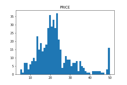
plt.show()The distribution of “PRICES”, the target variable, is below. In the right side, we can see the so high-price houses. Note here that considering such a high-price data may get a prediction accuracy worse.
The distributions of the explanatory variables are below. We can see the difference in variance between the explanatory variables.

From the above figure, we can infer that the data of “CHAS” and “RAD” are NOT continuous values. Generally, such data that is not continuous is called a categorical variable.
Be careful when handling the categorical variable values, because there is no meaning in the magnitude relationship itself. For example, when a condominium and a house are represented by 0 and 1, respectively, there is no essential meaning in the magnitude relationship(0 < 1).
For the above reasons, let’s check the categorical variables individually.
We can easily confirm the number of each unique value by the “value_counts()” method in Pandas. The first column is the unique values. The second column is the counted numbers of unique values.
f['RAD'].value_counts()

>>  24.0    132
>>  5.0     115
>>  4.0     110
>>  3.0      38
>>  6.0      26
>>  8.0      24
>>  2.0      24
>>  1.0      20
>>  7.0      17
>>  Name: RAD, dtype: int64
It is important to check the data visually. It is easy to visualize the counted numbers of unique values for each column.
f['CHAS'].value_counts().plot.bar(title="CHAS")
f['RAD'].value_counts().plot.bar(title="RAD")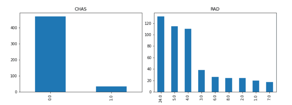
Correlation of Variables
Here, we confirm the correlation of variables. The correlation is so important because the higher correlation indicates the higher contribution basically. Conversely, you have the option of removing variables that contribute less. By dropping variables that contribute less, the risk of overfitting is reduced
We can easily calculate the correlation matrix between the variables(or columns) by the “corr()” function in Pandas.
f.corr()


             CRIM        ZN     INDUS      CHAS       NOX        RM       AGE       DIS       RAD       TAX   PTRATIO         B     LSTAT    PRICES
   CRIM  1.000000 -0.200469  0.406583 -0.055892  0.420972 -0.219247  0.352734 -0.379670  0.625505  0.582764  0.289946 -0.385064  0.455621 -0.388305
     ZN -0.200469  1.000000 -0.533828 -0.042697 -0.516604  0.311991 -0.569537  0.664408 -0.311948 -0.314563 -0.391679  0.175520 -0.412995  0.360445
  INDUS  0.406583 -0.533828  1.000000  0.062938  0.763651 -0.391676  0.644779 -0.708027  0.595129  0.720760  0.383248 -0.356977  0.603800 -0.483725
   CHAS -0.055892 -0.042697  0.062938  1.000000  0.091203  0.091251  0.086518 -0.099176 -0.007368 -0.035587 -0.121515  0.048788 -0.053929  0.175260
    NOX  0.420972 -0.516604  0.763651  0.091203  1.000000 -0.302188  0.731470 -0.769230  0.611441  0.668023  0.188933 -0.380051  0.590879 -0.427321
     RM -0.219247  0.311991 -0.391676  0.091251 -0.302188  1.000000 -0.240265  0.205246 -0.209847 -0.292048 -0.355501  0.128069 -0.613808  0.695360
    AGE  0.352734 -0.569537  0.644779  0.086518  0.731470 -0.240265  1.000000 -0.747881  0.456022  0.506456  0.261515 -0.273534  0.602339 -0.376955
    DIS -0.379670  0.664408 -0.708027 -0.099176 -0.769230  0.205246 -0.747881  1.000000 -0.494588 -0.534432 -0.232471  0.291512 -0.496996  0.249929
    RAD  0.625505 -0.311948  0.595129 -0.007368  0.611441 -0.209847  0.456022 -0.494588  1.000000  0.910228  0.464741 -0.444413  0.488676 -0.381626
    TAX  0.582764 -0.314563  0.720760 -0.035587  0.668023 -0.292048  0.506456 -0.534432  0.910228  1.000000  0.460853 -0.441808  0.543993 -0.468536
PTRATIO  0.289946 -0.391679  0.383248 -0.121515  0.188933 -0.355501  0.261515 -0.232471  0.464741  0.460853  1.000000 -0.177383  0.374044 -0.507787
      B -0.385064  0.175520 -0.356977  0.048788 -0.380051  0.128069 -0.273534  0.291512 -0.444413 -0.441808 -0.177383  1.000000 -0.366087  0.333461
  LSTAT  0.455621 -0.412995  0.603800 -0.053929  0.590879 -0.613808  0.602339 -0.496996  0.488676  0.543993  0.374044 -0.366087  1.000000 -0.737663
 PRICES -0.388305  0.360445 -0.483725  0.175260 -0.427321  0.695360 -0.376955  0.249929 -0.381626 -0.468536 -0.507787  0.333461 -0.737663  1.000000
Like the above, it is easy to calculate the correlation matrix, however, it is difficult to grasp the tendency with simple numerical values.
In such a case, let’s utilize the heat map function included in “seaborn”, the library for plotting. Then, we can confirm the correlation visually.
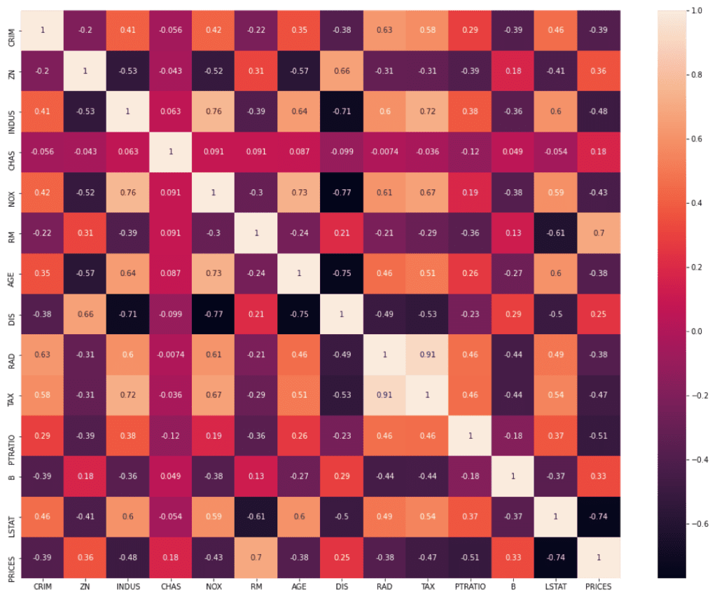
Here, we focus on the relationship between “PRICES” – OTHER(“CRIM”, “ZN”, “INDUS”…etc). We can clearly see that “RM” and “LSTAT” are high correlated to “PRICES”.

Summary
So far we have seen how to perform EDA briefly. The purpose of EDA is to properly identify the nature of the dataset. Proper EDA can make it possible to explore the next step effectively, e.g. feature engineering and modeling methods.