The famous machine learning algorithms, such as Random Forest and Gradient Boosting Decision Trees(GBDT), are based on the decision tree method. Therefore, it is a good choice to start by learning a decision tree method.
In this post, we will see a brief description of the decision tree method and the sample code. We will apply a regression analysis of the decision tree method to the Boston house prices dataset.
What is a decision tree method?
The decision tree is a method of predicting by repeating the case classification of input information. It is recognized as a convenient technique because it can be used for both regression and classification problems.
The model created by a decision tree method becomes more expressive as the number of conditional branches increases. On the other hand, it can be overfitting to the training data, taking into account non-essential conditional branches.
From here, let’s apply a decision tree method to the regression problem.
Load the Dataset
In this post, we use the Boston house prices dataset in the scikit-learn library. We can easily load the dataset by just two lines below.
from sklearn.datasets import load_boston
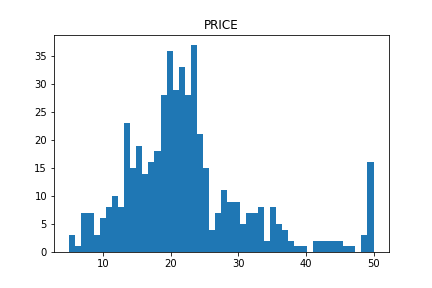
dataset = load_boston()The details of the Boston house prices dataset, an exploratory data analysis, is introduced in another post.
Read the Dataset as Pandas DataFrame
import pandas as pd
f = pd.DataFrame(dataset.data)
f.columns = dataset.feature_names
f["PRICES"] = dataset.target
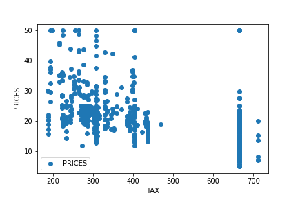
f.head()Example: RM vs PRICES
Let’s try to check the correlation between only “PRICES” and “RM”.
import matplotlib.pylab as plt  #-- "Matplotlib" for Plotting

f.plot(x="RM", y="PRICES", style="o")
plt.ylabel("PRICES")
plt.show()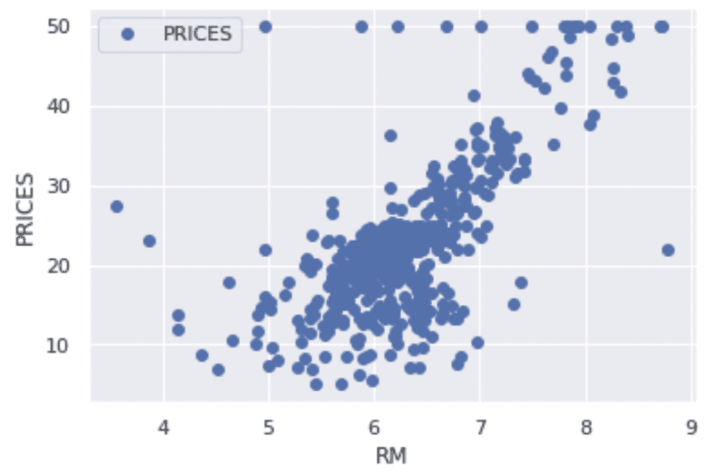
Variables to be used
TargetName = "PRICES"
FeaturesName = [\
              #-- "Crime occurrence rate per unit population by town"
              "CRIM",\
              #-- "Percentage of 25000-squared-feet-area house"
              'ZN',\
              #-- "Percentage of non-retail land area by town"
              'INDUS',\
              #-- "Index for Charlse river: 0 is near, 1 is far"
              'CHAS',\
              #-- "Nitrogen compound concentration"
              'NOX',\
              #-- "Average number of rooms per residence"
              'RM',\
              #-- "Percentage of buildings built before 1940"
              'AGE',\
              #-- 'Weighted distance from five employment centers'
              "DIS",\
              ##-- "Index for easy access to highway"
              'RAD',\
              ##-- "Tax rate per $100,000"
              'TAX',\
              ##-- "Percentage of students and teachers in each town"
              'PTRATIO',\
              ##-- "1000(Bk - 0.63)^2, where Bk is the percentage of Black people"
              'B',\
              ##-- "Percentage of low-class population"
              'LSTAT',\
              ]
We prepare the input and target variables as “X” and “Y”.
X = f[FeaturesName]
Y = f[TargetName]
No need to perform standardization
We don’t need to standardize or normalize the numerical variable in a decision tree analysis. This is because the decision tree classifies the cases by focusing only on the magnitude relationship of the values. Therefore, the difference in the scale of the variables does NOT affect the final result.
Split the Dataset
To validate the performance of the trained model against unseen data, we have to split the dataset into the train data and the test data.
We pass the dataset “(X, Y)” to the “train_test_split()” function. The rate of the train data and the test data is defined by the argument “test_size”. Here, the rate is set to be “8:2”. And, “random_state” is set for reproducibility. You can use any number.
from sklearn.model_selection import train_test_split
X_train, X_test, Y_train, Y_test = train_test_split(X, Y, test_size=0.2, random_state=99)
Create a model instance
We create a decision-tree instance and pass the training dataset to it.
# Fitting Decision Tree Regression to the dataset
from sklearn.tree import DecisionTreeRegressor
regressor = DecisionTreeRegressor()
regressor.fit(X_train, Y_train)
Validation
To validate the performance of the model, we predict the training and validation data.
y_pred_train = regressor.predict(X_train)
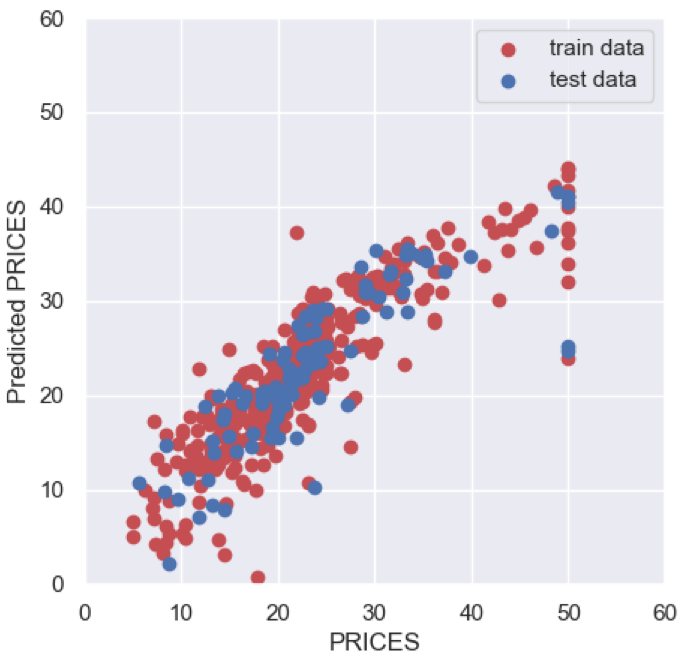
y_pred_test = regressor.predict(X_test)Then, let’s visualize the result by matplotlib.
import seaborn as sns

plt.figure(figsize=(5, 5), dpi=100)
sns.set()
plt.xlabel("PRICES")
plt.ylabel("Predicted PRICES")
plt.xlim(0, 60)
plt.ylim(0, 60)
plt.scatter(Y_train, y_pred_train, lw=1, color="r", label="train data")
plt.scatter(Y_test, y_pred_test, lw=1, color="b", label="test data")
plt.legend()
plt.show()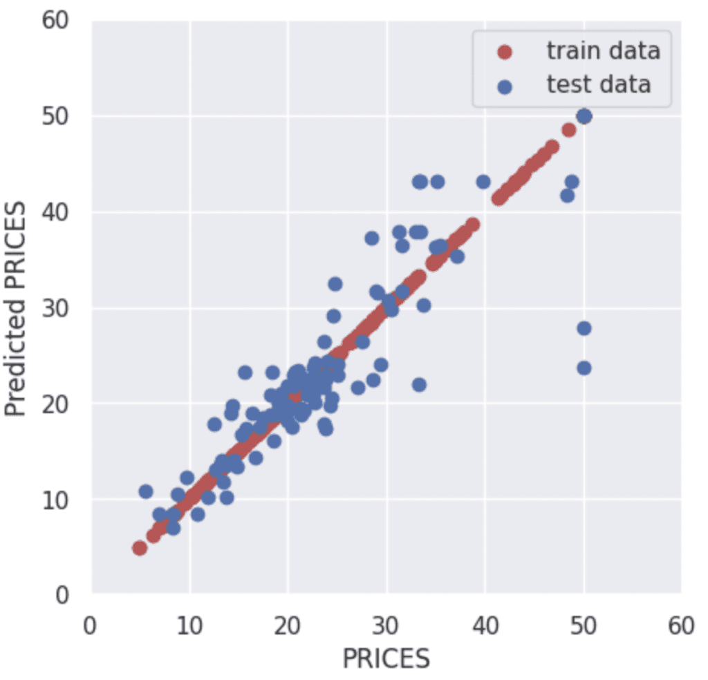
The red and blue circles show the results of the training and validation data, respectively.
To confirm the prediction accuracy of the verification data, we check $R^{2}$ score, the coefficient of determination. $R^{2}$ is the index for how much the model is fitted to the dataset. When $R^{2}$ is close to $1$, the model accuracy is good. Conversely, when $R^{2}$ approaches $0$, it means that the model accuracy is poor.
We can calculate $R^{2}$ by the “r2_score()” function in scikit-learn.
from sklearn.metrics import r2_score
R2 = r2_score(Y_test, y_pred_test)
R2

>>  0.7368516281144417
The score $0.74$ is not bad.
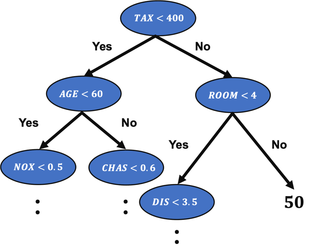
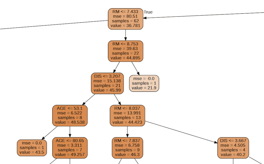
Visualization of Tree Structure
We can check the tree structure of the model.
from sklearn.tree import export_graphviz
import pydotplus
from IPython.display import Image
export_graphviz(regressor, out_file="tree-structure.dot", feature_names=X_train.columns, filled=True, rounded=True)
g = pydotplus.graph_from_dot_file(path="tree-structure.dot")
Image(g.create_png())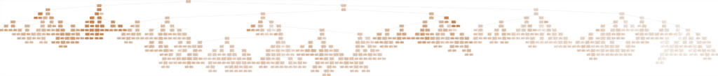
Summary
We have seen the decision tree analysis against the Boston house prices dataset. In the case of one decision tree model, the accuracy of the validation data is a little worse than the accuracy of the training data. One way to improve accuracy is to use the mean values predicted by multiple models. This is called an ensemble. In the decision tree model base, this ensemble method is called Random Forest and can be easily implemented.
The author hopes this blog helps readers a little.