PyCaret is a useful auto ML python library because we can deploy machine learning models with low codes. We can also perform preprocessing, compare models, and tune hyperparameters, of course with low codes.
Recently, PyCaret version 2.3.6 was released. This is big news because several new wonderful functions were implemented in this release version! The details are described in this article written by PyCaret creator.
In this article, we will check the summary of this release. And, the three new features will be introduced.
New Features
Dashboard: interactive dashborad for a trained model.
EDA: Explonatory Data Analysis
Convert Model: converting a trained model from python into other programing language, such as C, Java, Go, JavaScript, Visual Basic, C#, PowerShell, R, PHP, Dart, Haskell, Ruby, F#.
As seeing the above new feature list, PyCaret is evolving dramatically!
In the following, we will introduce some of the new functions using normal regression analysis as an example.
Installation
If you have NOT installed PyCaret yet, you can easily install it by the following command. Note that specify the PyCaret version!
$pip install pycaret==2.3.6
From here, the sample code in this post is supposed to run on Jupyter Notebook.
Import Libraries
In advance, we load all the modules for regression analysis of PyCaret.
from pycaret.regression import *
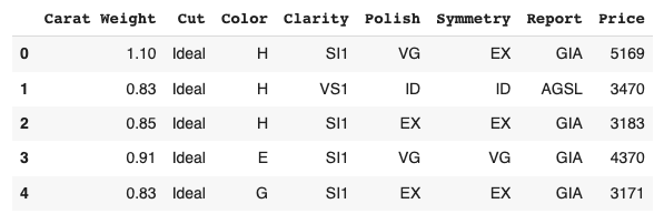
Dataset
We use the diamond dataset for regression analysis.
# load dataset
from pycaret.datasets import get_data

df = get_data('diamond')
Set up the environment by the “setup()” function
PyCaret needs to initialize an environment by the “setup()” function. Conveniently, PyCaret infers the data type of the variables in the dataset.
Arguments of setup() are the dataset as Pandas DataFrame, the target-column name, and the “session_id”. The “session_id” equals a random seed.
s = setup(df, target='Price', session_id = 20220121)
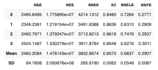
Create a Model
Due to the simplicity of the technique and the interpretability of the model, we will adopt lr(Linear Regression) for the models that will be used below.
We can create the selected model by create_model() with the argument of “lr”. Another argument of “fold” is the number of cross-validation. “fold = 4” indicates we split the dataset into four and train the model in each dataset separately.
lr = create_model("lr", fold=4)
Introduction of New Features of PyCaret 2.3.6
From here, we will introduce two of the new features.
Convert model
With this new function, we can convert a trained model into another language, e. g. from python to C. This function is very useful when operating the created model.
Note that we need to install the dependency libraries.
PyCaret is a useful auto ML python library because we can deploy machine learning models with low codes. We can also perform preprocessing, compare models, and tune hyperparameters, of course with low codes.
Recently, PyCaret version 2.3.6 was released. This is big news because several new wonderful functions were implemented in this release version! The details are described in this article written by PyCaret creator.
In this article, we will check the summary of this release. And, the three new features will be introduced.
New Features
Dashboard: interactive dashborad for a trained model.
EDA: Explonatory Data Analysis
Convert Model: converting a trained model from python into other programing language, such as C, Java, Go, JavaScript, Visual Basic, C#, PowerShell, R, PHP, Dart, Haskell, Ruby, F#.
As seeing the above new feature list, PyCaret is evolving dramatically!
In the following, we will introduce some of the new functions using normal regression analysis as an example.
Installation
If you have NOT installed PyCaret yet, you can easily install it by the following command. Note that specify the PyCaret version!
$pip install pycaret==2.3.6
From here, the sample code in this post is supposed to run on Jupyter Notebook.
Import Libraries
In advance, we load all the modules for regression analysis of PyCaret.
from pycaret.regression import *
Dataset
We use the diamond dataset for regression analysis.
# load dataset
from pycaret.datasets import get_data

df = get_data('diamond')
Set up the environment by the “setup()” function
PyCaret needs to initialize an environment by the “setup()” function. Conveniently, PyCaret infers the data type of the variables in the dataset.
Arguments of setup() are the dataset as Pandas DataFrame, the target-column name, and the “session_id”. The “session_id” equals a random seed.
s = setup(df, target='Price', session_id = 20220121)
Create a Model
Due to the simplicity of the technique and the interpretability of the model, we will adopt lr(Linear Regression) for the models that will be used below.
We can create the selected model by create_model() with the argument of “lr”. Another argument of “fold” is the number of cross-validation. “fold = 4” indicates we split the dataset into four and train the model in each dataset separately.
lr = create_model("lr", fold=4)
Introduction of New Features of PyCaret 2.3.6
From here, we will introduce two of the new features.
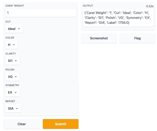
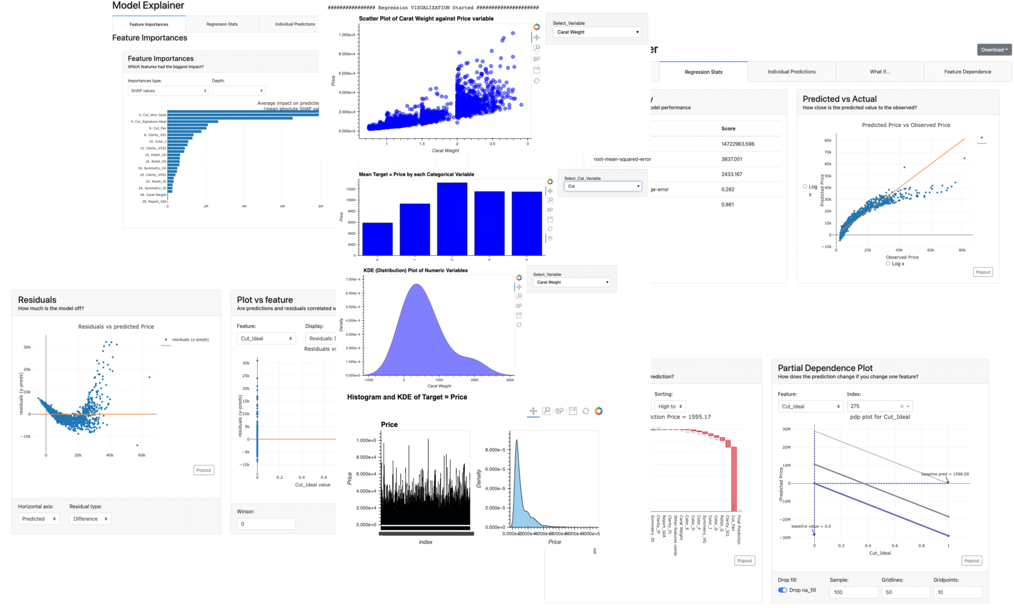
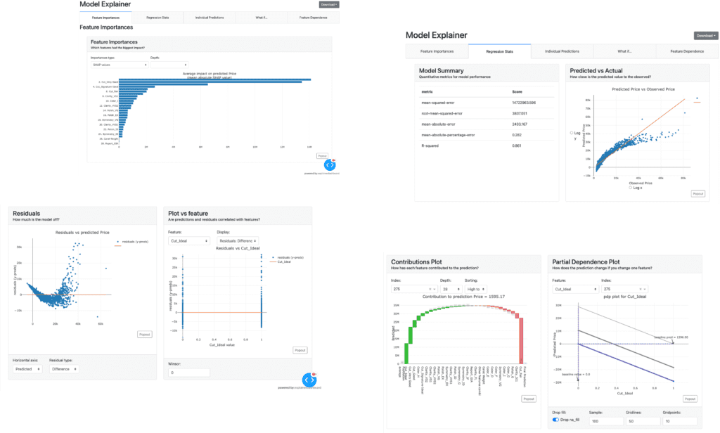
Dashboard
With this new function, we can create a dashboard for a trained model.
The dashboard function is implemented by ExplainerDashboard, we need the “explainerdashboard” library. We can install it with the pip command.
$pip install explainerdashboard
Then, we can create a dashboard.
dashboard(model)
Parts of the dashboard screen are introduced in the figure below.
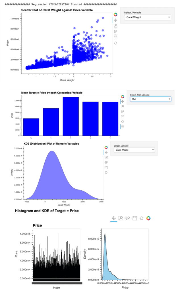
EDA(Exploratory Data Analysis)
This new function requires the “autoviz” library.
$pip install autoviz
Just 1 line code. We can perform the EDA.
eda()
Summary
We have seen the new features of PyCaret 2.3.6.
In this article, we saw the Dashboard and EDA function.
Just 1 line.
We can create a dashboard and perform the EDA of a trained model. Wouldn’t it be great? If you sympathize with it, please give it a try.
The author hopes this blog helps readers a little.
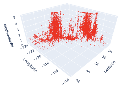
3D visualization is practical because we can understand relationships between variables in a dataset. For example, when EDA (Exploratory Data Analysis), it is a powerful tool to examine a dataset from various approaches.
For visualizing the 3D scatter, we use Plotly, the famous python open-source library. Although Plotly has so rich functions, it is a little bit difficult for a beginner. Compared to the famous python libraries matplotlib and seaborn, it is often not intuitive. For example, not only do object-oriented types appear in interfaces, but we often face them when we pass arguments as dictionary types.
Therefore, In this post, the basic skills for 3D visualization for Plotly are introduced. We can learn the basic functions required for drawing a graph through a simple example.
In this post, we use the “California Housing dataset” included in scikit-learn.
# Get a dataset instance
dataset = fetch_california_housing()
The “dataset” variable is an instance of the dataset. It stores several kinds of information, i.e., the explanatory-variable values, the target-variable values, the names of the explanatory variable, and the name of the target variable.
We can take and assign them separately as follows.
dataset.data: values of the explanatory variables dataset.target: values of the target variable (house prices) dataset.feature_names: the column names
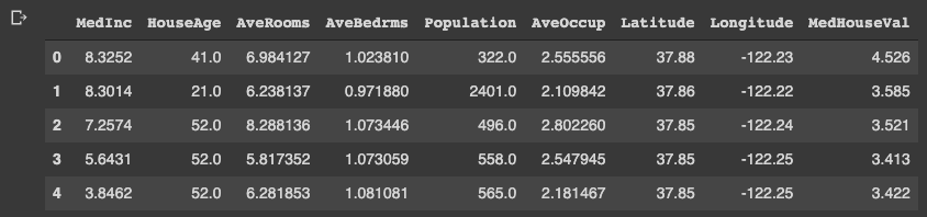
Note that we store the dataset as pandas DataFrame because it is convenient to manipulate data. And, the target variable “MedHouseVal” indicates the median house value for California districts, expressed in hundreds of thousands of dollars ($100,000).
# Store the dataset as pandas DataFrame
df = pd.DataFrame(dataset.data)
# Asign the explanatory-variable names
df.columns = dataset.feature_names
# Asign the target-variable name
df[dataset.target_names[0]] = dataset.target

df.head()
Variables to be used in each axis
Here, we prepare the variables to be used in each axis. Here, we use “Latitude” and “Longitude” for the x- and y-axis. And for the z-axis, we use “MedHouseVal”, the target variable.
xlbl = 'Latitude'
ylbl = 'Longitude'
zlbl = 'MedHouseVal'

x = df[xlbl]
y = df[ylbl]
z = df[zlbl]
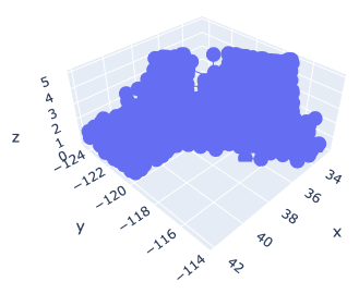
Basic Format for 3D Scatter
To get started, let’s create a 3D scatter figure. We use the “graph_objects()” module in Plotly. First, we creaete a graph instance as “fig”. Next, we add a 3D Scatter created by “go.Scatter3d()” to “fig” by the “go.add_traces()” module. Finally, we can visualize by “fig.show()”.
# import plotly.graph_objects as go

# Create a graph instance
fig = go.Figure()
# Add 3D Scatter to the graph instance
fig.add_traces(go.Scatter3d(
    x=x, y=y, z=z,
))
# Show the figure
fig.show()
However, you can see that the default settings are often inadequate.
Therefore, we will make changes to the following items to create a good-looking graph.
Marker size
Marker color
Plot Style
Axis label
Figure size
Save a figure as a HTML file
Marker size and color
We change the marker size and color. Note that we have to pass the argument as dictionary type.
# Create a graph instance
fig = go.Figure()
# Add 3D Scatter to the graph instance
fig.add_traces(go.Scatter3d(
    x=x, y=y, z=z,
    # marker size and color
    marker=dict(color='red', size=1),
))
# Show the figure
fig.show()
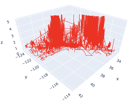
The marker size has been changed from 3 to 1. And, the color has also been changed from blue to red.
Here, by reducing the marker size, we can see that not only points but also lines are mixed. To make a point-only graph, you need to explicitly specify “Marker” in the mode argument.
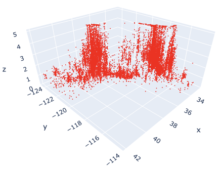
Marker Style
We can easily specify as marker style.
# Create a graph instance
fig = go.Figure()
# Add 3D Scatter to the graph instance
fig.add_traces(go.Scatter3d(
    x=x, y=y, z=z,
    # marker size and color
    marker=dict(color='red', size=1),
    # marker style
    mode='markers',
))
# Show the figure
fig.show()
Of course, you can easily change the line style. Just change the “mode” argument from “markers” to “lines”.
Axis Label
Next, we add the label to each axis.
While we frequently create axis labels, Plotly is less intuitive than matplotlib. Therefore, it will be convenient to check it once here.
We use the “go.update_layout()” module for changing the figure layout. And, as an argument, we pass the “scene” as a dictionary, where we pass each axis label as dictionary value to its key.
# Create a graph instance
fig = go.Figure()
# Add 3D Scatter to the graph instance
fig.add_traces(go.Scatter3d(
    x=x, y=y, z=z,
    # marker size and color
    marker=dict(color='red', size=1),
    # marker style
    mode='markers',
))
# Axis Labels
fig.update_layout(
    scene=dict(
        xaxis_title=xlbl,
        yaxis_title=ylbl,
        zaxis_title=zlbl,
        )
    )
# Show the figure
fig.show()
Figure Size
We sometimes face the situation to change the figure size. It can be easily performed just one line by the “go.update_layout()” module.
fig.update_layout(height=600, width=600)
Save a figure as HTML format
We can save the created figure by the “go.write_html()” module.
fig.write_html('3d_scatter.html')
Since the figure is created and saved as an HTML file, we can confirm it interactively by a web browser, e.g. Chrome and Firefox.
Cheat Sheet for 3D Scatter
# Create a graph instance
fig = go.Figure()
# Add 3D Scatter to the graph instance
fig.add_traces(go.Scatter3d(
    x=x, y=y, z=z,
    # marker size and color
    marker=dict(color='red', size=1),
    # marker style
    mode='markers',
))
# Axis Labels
fig.update_layout(
    scene=dict(
        xaxis_title=xlbl,
        yaxis_title=ylbl,
        zaxis_title=zlbl,
        )
    )
# Figure size
fig.update_layout(height=600, width=600)
# Save the figure
fig.write_html('3d_scatter.html')
# Show the figure
fig.show()
Summary
We have seen how to create the 3D scatter graph. By plotly, we can create it easily.
The author believes that the code example in this post makes it easy to understand and implement a 3D scatter graph for readers.
This time we tried with only one variable, but the case for multi variables can be implemented in the same way. We have defined hyperparameters as a dictionary, but we just need to add additional variables there.
The author hopes this blog helps readers a little.
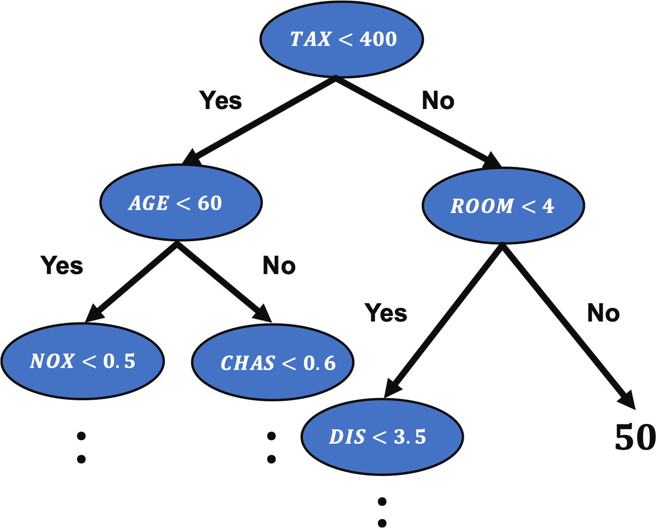
A decision tree method is an important method in machine learning because the famous algorithms, such as Random Forest and Gradient Boosting Decision Trees(GBDT), are based on the decision tree method.
In the previous post, we have seen a regression analysis of the decision tree method to the Boston house prices dataset.
Grid search is a method to explore all possible combinations.
For example, we think about two variables, $x_1$ and $x_2$, where $x_1 = [1, 2, 3]$ and $x_2 = [4, 5, 6]$. In this case, all possible combinations are as follows.
Therefore, computational costs increase proportionally to the number of variables and those levels.
As you can imagine, the disadvantage of grid search is that computational costs increase when the number of variables and those levels become larger.
Baseline of Analysis without tuning the Hyperparameters
First, we import the necessary libraries. And set the random seed.
import numpy as np
import pandas as pd
from sklearn.datasets import load_boston
from sklearn.tree import DecisionTreeRegressor
from sklearn.model_selection import train_test_split
from sklearn.metrics import r2_score
import matplotlib.pylab as plt
import seaborn as sns
sns.set()

random_state = 20211006
In this post, we use the Boston house prices dataset in the scikit-learn library. We can easily load the dataset by just two lines below.
dataset = load_boston()
The details of the Boston house prices dataset, an exploratory data analysis, are introduced in another post.
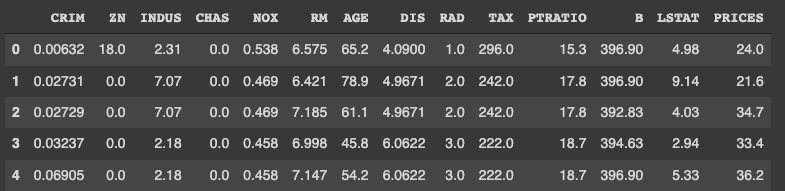
It is convenient to get the data as pandas DataFrame, making it possible to manipulate table data.
# explanatory data
df = pd.DataFrame(dataset.data)
df.columns = dataset.feature_names

# target data
df["PRICES"] = dataset.target

print(df.head())
Variables to be used
Here, we prepare the variable-name list. The description of each variable is also described in the comments.
TargetName = "PRICES"
FeaturesName = [
              #-- "Crime occurrence rate per unit population by town"
              "CRIM",
              #-- "Percentage of 25000-squared-feet-area house"
              'ZN',
              #-- "Percentage of non-retail land area by town"
              'INDUS',
              #-- "Index for Charlse river: 0 is near, 1 is far"
              'CHAS',
              #-- "Nitrogen compound concentration"
              'NOX',
              #-- "Average number of rooms per residence"
              'RM',
              #-- "Percentage of buildings built before 1940"
              'AGE',
              #-- 'Weighted distance from five employment centers'
              "DIS",
              ##-- "Index for easy access to highway"
              'RAD',
              ##-- "Tax rate per $100,000"
              'TAX',
              ##-- "Percentage of students and teachers in each town"
              'PTRATIO',
              ##-- "1000(Bk - 0.63)^2, where Bk is the percentage of Black people"
              'B',
              ##-- "Percentage of low-class population"
              'LSTAT',
              ]
We prepare the explanatory and target variables as “X” and “y”.
X = df[FeaturesName]
y = df[TargetName]
No need to perform standardization
We don’t need to standardize or normalize the numerical variable in a decision tree analysis. This is because the decision tree classifies the cases by focusing only on the magnitude relationship of the values. Therefore, the difference in the scale of the variables does NOT affect the final result.
Split the Dataset
To validate the performance of the trained model against unseen data, we have to split the dataset into the train data and the test data.
We pass the dataset “(X, y)” to the “train_test_split()” function. The rate of the train data and the test data is defined by the argument “test_size”. Here, the rate is set to be “8:2”. And, “random_state” is set for reproducibility. You can use any number.
X_train, X_test, y_train, y_test = train_test_split(X, y, test_size=0.2, random_state=random_state)
Create a model instance and Train the model
We create a decision tree instance as “regressor”, and pass the training dataset to it.
As an indicator of the accuracy of the model, we use the $R^{2}$ score, which is the index for how much the model is fitted to the dataset. The value range is from 0 to 1. When the value is close to $1$, indicating the model accuracy is good. Conversely, when $R^{2}$ approaches $0$, it means that the model accuracy is poor.
We can calculate $R^{2}$ by the “r2_score()” function in scikit-learn.
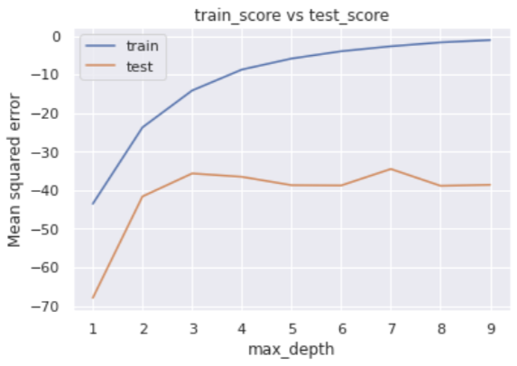
In this post, we tune one of the most parameters, “max_depth”. In the default setting “None”, decision trees can be branched without restrictions. This setting makes it overly easy to adapt to training, i.e., overfitting.
Therefore, we will try to find the optimum solution by setting the number of branches in the range of 1 to 9.
Define the argument name and search range as a dictionary.
Next, we define an instance of the grid search, where we pass the decision-tree-model instance and the above dictionary. Note that “cv” and “scoring” indicate the number of folds and metrics for validation, respectively.
from sklearn.model_selection import GridSearchCV

# Define a Grid Search as gs
gs = GridSearchCV(regressor, params, cv=5, scoring='neg_mean_squared_error', return_train_score=True)
Now, we are ready to go. Execute the grid search!
# Execute a grid search
gs.fit(X, y)
After finishing, we confirm the evaluations of the grid search. We check the metrics for each fold.
The error for the training data decreases as max_depth increases, while the error for the verification data does not show any significant improvement when the number of branches is 4 or more in the middle.
We can easily check the best parameter, i.e., optimized “max_depth”.
# Best parameters
print(gs.best_params_ )

>>  {'max_depth': 7}
The result suggests that the “max_depth” of 7 is the best.
In addition, we can also get the best model, i.e., when the “max_depth” of 7
# Best-parameter model
regressor_best = gs.best_estimator_
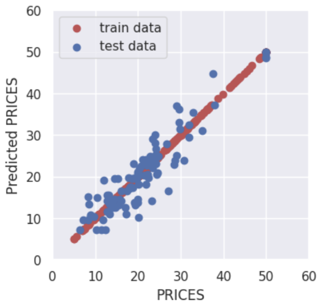
Here, let’s evaluate the $R2$ value again. We will see the model has been improved.
By adjusting the hyperparameters, the accuracy for the training data is reduced, but the accuracy for the validation data is improved.
In other words, it was a situation of overfitting against the training data, but by setting appropriate hyperparameters, the generalization performance of the model was improved.
Summary
We have seen how to tune the hyperparameters of the decision tree model. In this post, we adopt a Grid Search method. A grid search method is easy to understand and implement.
This time we tried with only one variable, but the case for multi variables can be implemented in the same way. We have defined hyperparameters as a dictionary, but we just need to add additional variables there.
The author hopes this blog helps readers a little.
We need a dataset to try out quickly something new method we learned. Therefore, it’s very important to get used to working with open datasets.
In this post, several open datasets, which are included in scikit-learn, will be introduced. From scikit-learn, we can easily and quickly use these datasets for regression and classification analyses.
scikit-learn is one of the famous python libraries for machine learning. scikit-learn is easy to use, powerful, and including a variety of techniques. It can be widely used from statistical analysis to machine learning to deep learning.
Open Toy datasets in scikit-learn
scikit-learn is not only used to implement machine learning but also contains various datasets. it should be noted here that the toy dataset introduced below can be used offline once scikit-learn is installed.
By using scikit-learn, we can use the above datasets in the same way.
Let’s first take the Boston home price dataset as an example. Once you understand this example, you can treat the rest of the dataset as well.
Import common libraries
Here, import the commonly used python library.
import pandas as pd
Boston house prices dataset
This dataset is for regression analysis. Therefore, we can utilize this dataset to try a method for regression analysis you learned.
First, we import the dataset module from scikit-learn. The dataset is included in the sklearn.datasets module.
from sklearn.datasets import load_boston
Second, create the instance of the dataset. In this instance, various information is stored, i.e., the explanatory data, the names of features, the regression target data, and the description of the dataset. Then, we can extract and use information from this instance as needed.
# instance of the boston house-prices dataset
dataset = load_boston()
We can confirm the details of the dataset by the DESCR method.
print(dataset.DESCR)


>> .. _boston_dataset:
>>
>> Boston house prices dataset
>> ---------------------------
>>
>> **Data Set Characteristics:**
>>
>>     :Number of Instances: 506
>>
>>     :Number of Attributes: 13 numeric/categorical predictive. Median Value (attribute 14) is usually the target.
>>
>>     :Attribute Information (in order):
>>         - CRIM     per capita crime rate by town
>>         - ZN       proportion of residential land zoned for lots over 25,000 sq.ft.
>>         - INDUS    proportion of non-retail business acres per town
>>         - CHAS     Charles River dummy variable (= 1 if tract bounds river; 0 otherwise)
>>         - NOX      nitric oxides concentration (parts per 10 million)
>>         - RM       average number of rooms per dwelling
>>         - AGE      proportion of owner-occupied units built prior to 1940
>>         - DIS      weighted distances to five Boston employment centres
>>         - RAD      index of accessibility to radial highways
>>         - TAX      full-value property-tax rate per $10,000
>>         - PTRATIO  pupil-teacher ratio by town
>>         - B        1000(Bk - 0.63)^2 where Bk is the proportion of blacks by town
>>         - LSTAT    % lower status of the population
>>         - MEDV     Median value of owner-occupied homes in $1000's
>>
>>     :Missing Attribute Values: None
>>
>>     :Creator: Harrison, D. and Rubinfeld, D.L.
>>
>>     .
>>     .
>>     .
Next, we confirm the contents of the dataset.
The contents of the dataset variable “dataset” can be accessed by specific methods. In this variable, several kinds of information are stored. The list of them is as follows.
dataset.data: the explanatory-variable values dataset.feature_names: the explanatory-variable names dataset.target: values of the target variable
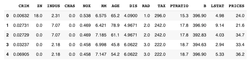
First, we take the data and the feature names of the explanatory variables.
The data type of the above variable X is numpy array. For convenience, we convert the dataset into the Pandas DataFrame type. With the DataFrame type, we can easily manipulate the table-type dataset and perform the preprocessing.
# convert the data type from numpy array into pandas DataFrame
X = pd.DataFrame(X, columns=feature_names)
# display the first five rows.
print(X.head())
>> CRIM ZN INDUS CHAS NOX ... RAD TAX PTRATIO B LSTAT
>> 0 0.00632 18.0 2.31 0.0 0.538 ... 1.0 296.0 15.3 396.90 4.98
>> 1 0.02731 0.0 7.07 0.0 0.469 ... 2.0 242.0 17.8 396.90 9.14
>> 2 0.02729 0.0 7.07 0.0 0.469 ... 2.0 242.0 17.8 392.83 4.03
>> 3 0.03237 0.0 2.18 0.0 0.458 ... 3.0 222.0 18.7 394.63 2.94
>> 4 0.06905 0.0 2.18 0.0 0.458 ... 3.0 222.0 18.7 396.90 5.33
Finally, we take the target-variable data.
# target variable
y = dataset.target
# display the first five elements.
print(y[0:5])
>> [24. 21.6 34.7 33.4 36.2]
Now you have the explanatory variable X and the target variable y ready. In the real analysis, the process from here is performing preprocessing the data, creating the model, and validating the accuracy of the model.
You can do the same procedures for other datasets. The code for each dataset is described below.
Iris dataset
This dataset is for classification analysis.
from sklearn.datasets import load_iris
# instance of the iris dataset
dataset = load_iris()
# explanatory variables
X = dataset.data
# feature names
feature_names = dataset.feature_names
# convert the data type from numpy array into pandas DataFrame
X = pd.DataFrame(X, columns=feature_names)
# target variable
y = dataset.target
Diabetes dataset
This dataset is for regression analysis.
from sklearn.datasets import load_diabetes


# instance of the Diabetes dataset
dataset = load_diabetes()
# explanatory variables
X = dataset.data
# feature names
feature_names = dataset.feature_names
# convert the data type from numpy array into pandas DataFrame
X = pd.DataFrame(X, columns=feature_names)
# target variable
y = dataset.target
Digits dataset
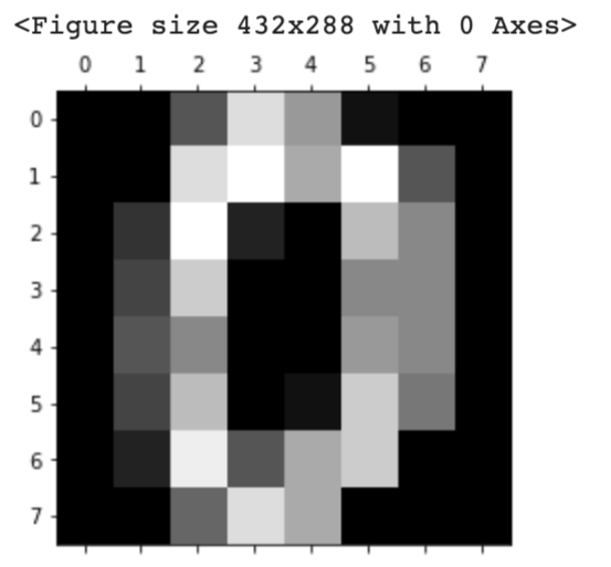
This dataset is for classification analysis. It must be noted here that this dataset is image data. Therefore, the methods for taking each data are different from other datasets.
dataset.images: the raw image data dataset.feature_names: the explanatory-variable names dataset.target: values of the target variable
from sklearn.datasets import load_digits


# instance of the digits dataset
dataset = load_digits()
# explanatory variables
X = dataset.images  # X.shape is (1797, 8, 8)

# target variable(0, 1, 2, .., 8, 9)
y = dataset.target

# Display the image
import matplotlib.pyplot as plt
plt.gray()
plt.matshow(X[0])
plt.show()
Physical excercise linnerud dataset
This dataset is for multi-target regression analysis. In this dataset, the target variable has three outputs.
from sklearn.datasets import load_linnerud


# instance of the physical excercise linnerud dataset
dataset = load_linnerud()
# explanatory variables
X = dataset.data
# feature names
feature_names = dataset.feature_names
# convert the data type from numpy array into pandas DataFrame
X = pd.DataFrame(X, columns=feature_names)
# target variable
y = dataset.target

X.head()
print(y)
Wine dataset
This dataset is for classification analysis.
from sklearn.datasets import load_wine


# instance of the wine dataset
dataset = load_wine()
# explanatory variables
X = dataset.data
# feature names
feature_names = dataset.feature_names
# convert the data type from numpy array into pandas DataFrame
X = pd.DataFrame(X, columns=feature_names)
# target variable
y = dataset.target
Breast cancer wisconsin dataset
This dataset is for regression analysis.
from sklearn.datasets import load_breast_cancer


# instance of the Breast cancer wisconsin dataset
dataset = load_breast_cancer()
# explanatory variables
X = dataset.data
# feature names
feature_names = dataset.feature_names
# convert the data type from numpy array into pandas DataFrame
X = pd.DataFrame(X, columns=feature_names)
# target variable
y = dataset.target
Summary
In this post, we have seen several famous datasets in scikit-learn. Open datasets are important to try out quickly something new method we learned.
Therefore, let’s get used to working with open datasets.
By streamlit, we can deploy our python script on a web app easier.
This post will see how to deploy our principal-component-analysis(PCA) code on a web app. In a web app format, we can try it in interactive. The origin of the PCA analysis in this post is introduced in another post.
It is easy to install streamlit by pip, just like any other Python module.
pip install streamlit
Run the web app
The web app will be opened by the following command in the web browser.
$ streamlit run main.py
Appendix: Dockerfile
If you use docker, you can use the Dockerfile described below. You can try the code in this post immediately.
FROM python:3.9

WORKDIR /opt
RUN pip install --upgrade pip
RUN pip install numpy==1.21.0 \
				pandas==1.3.0 \
				scikit-learn==0.24.2 \
				plotly==5.1.0 \
				matplotlib==3.4.2 \
				seaborn==0.11.1 \
				streamlit==0.84.1

WORKDIR /work
You can build a docker container from the docker image created from the Dockerfile.
Execute the following commands.
$ docker run -it -p 8888:8888 -v ~/(your work directory):/work <Image ID> bash
$ streamlit run main.py --server.port 8888
Note that “-p 8888: 8888” is an instruction to connect the host(your local PC) with the docker container. The first and second 8888 indicate the host’s and the container’s port numbers, respectively.
Besides, by the command “streamlit run ” with the option “–server.port 8888”, we can access a web app from a web browser with the URL “localhost: 8888”.
Please refer to the details on how to execute your python and streamlit script in a docker container in the following post.
import streamlit as st
import numpy as np
import pandas as pd
from sklearn.preprocessing import StandardScaler
from sklearn.metrics import accuracy_score
from sklearn.datasets import load_wine
from sklearn.decomposition import PCA
import plotly.graph_objects as go
Title
You can create the title quickly by ‘st.title()’.
‘st.title()’: creates a title box
# Title
st.title('PCA applied to Wine dataset')
Load and Show the dataset
First, we load the dataset by ‘load_wine()’, and set it as pandas DataFrame by ‘pd.DataFame’.
Second, we assign the columns of the dataset and the target variable. The columns of the dataset are stored in ‘dataset.feature_names’. Similarly, the target variable is also stored in ‘dataset.target’.
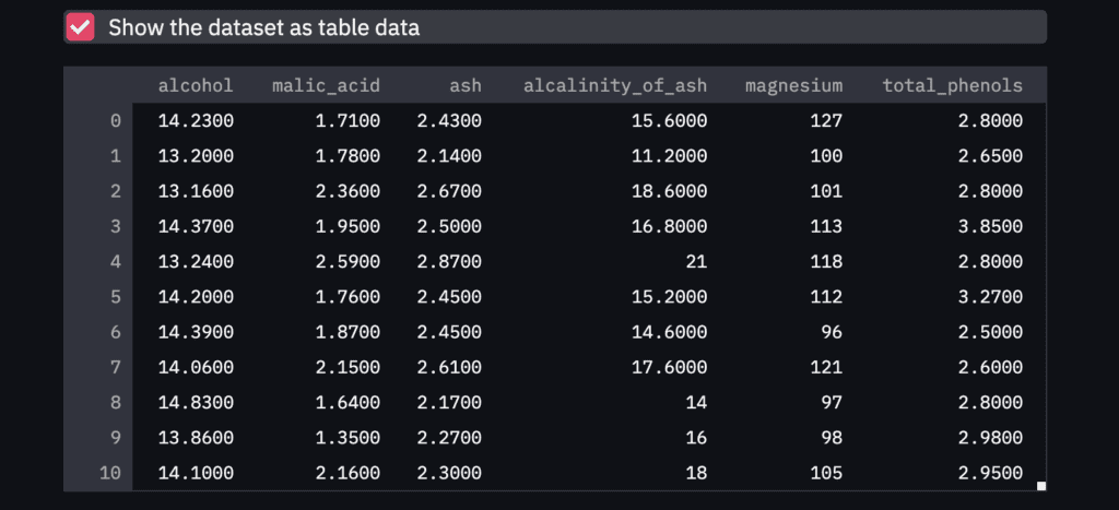
Third, we show the dataset as a table-data format if we check the checkbox. The checkbox is create by ‘st.checkbox()’, and a table data is shown by ‘st.dataframe()’.
‘st.checkbox()’: creates a check box, which returns True when checked. ‘st.dataframe()’: display the data frame of the argument.
# load wine dataset
dataset = load_wine()
# Prepare explanatory variable as DataFrame in pandas
df = pd.DataFrame(dataset.data)
# Assign the names of explanatory variables
df.columns = dataset.feature_names
# Add the target variable(house prices),
# where its column name is set "target".
df["target"] = dataset.target

# Show the table data when checkbox is ON.
if st.checkbox('Show the dataset as table data'):
    st.dataframe(df)
NOTE: Markdown
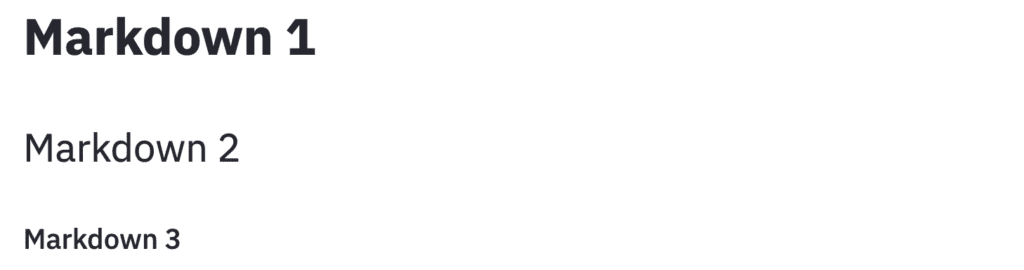
Here, it should be noted about ‘Markdown’, since, in the following descriptions, we will use the markdown format.
The markdown style is useful! For example, the following comment outed statement is shown in the web app as follows. With the markdown style, we can easily display the statement.
"""
# Markdown 1
## Markdown 2
### Markdown 3
"""
Standardization
Before performing the PCA, we have to perform standardization against explanatory variables.
# Prepare the explanatory and target variables
x = df.drop(columns=['target'])
y = df['target']

# Standardization
scaler = StandardScaler()
x_std = scaler.fit_transform(x)
You can refer to the details of standardization in the following post.
In this section, we perform the PCA and deploy it on streamlit.
We will create a design that interactively selects the number of principal components to be considered in the analysis. And, we select the principal components to be a plot.
Note that, we create these designs in the sidebar. It is easy by ‘st.sidebar’.
Number of principal components
First, we will create a design that interactively selects the number of principal components to be considered in the analysis.
By “st.sidebar”, the panels are created in sidebars.
And,
‘st.number_input()’: creates a panel, where we select the number.
# Number of principal components
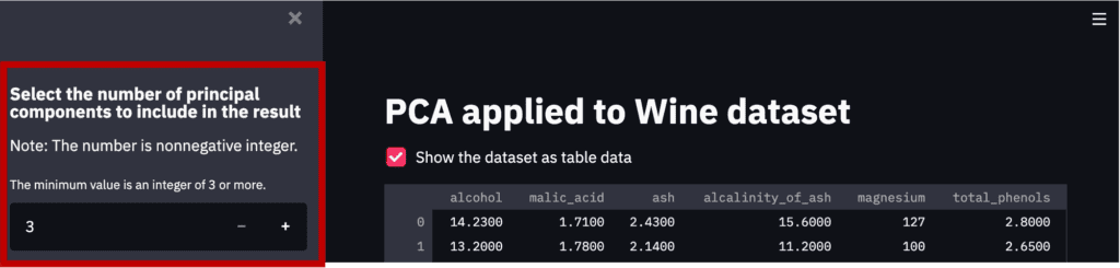
st.sidebar.markdown(
r"""
### Select the number of principal components to include in the result
Note: The number is nonnegative integer.
"""
)
num_pca = st.sidebar.number_input(
'The minimum value is an integer of 3 or more.',
value=3, # default value
step=1,
min_value=3)
Note that the part created by the above code is the red frame part in the figure below.
Perform the PCA
It is easy to perform the PCA by the “sklearn.decomposition.PCA()” module in scikit-learn. We pass the number of the principal components to the argument of “n_components”.
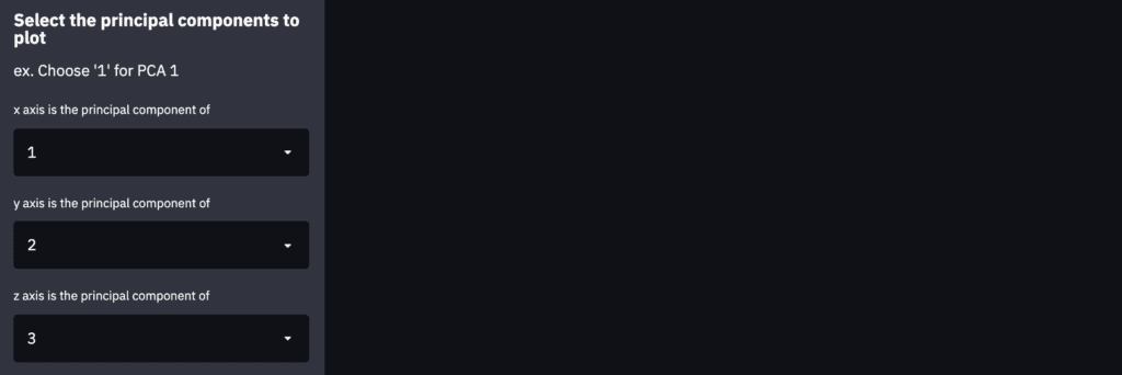
We create the panels in the sidebar to select the principal-component index to plot. This panel in the sidebar can be created by “st.sidebar.selectbox()”.
Note that we create the description as markdown in the sidebar using “st.sidebar”.
st.sidebar.markdown(
    r"""
    ### Select the principal components to plot
    ex. Choose '1' for PCA 1
    """
    )
# Index of PCA, e.g. 1 for PCA 1, 2 for PCA 2, etc..
idx_x_pca = st.sidebar.selectbox("x axis is the principal component of ", np.arange(1, num_pca+1), 0)
idx_y_pca = st.sidebar.selectbox("y axis is the principal component of ", np.arange(1, num_pca+1), 1)
idx_z_pca = st.sidebar.selectbox("z axis is the principal component of ", np.arange(1, num_pca+1), 2)
3D Plot by Plotly
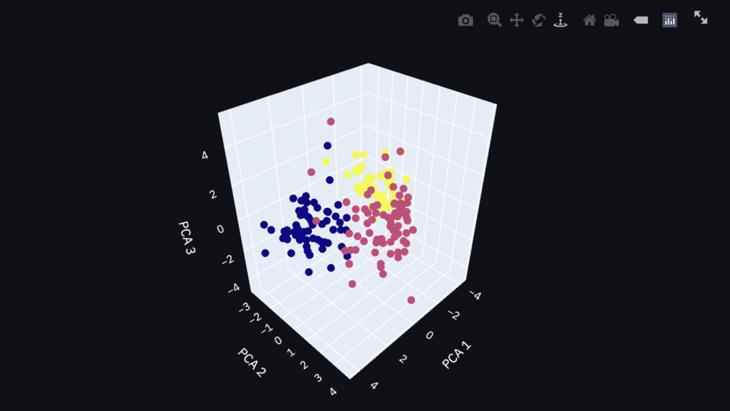
Finally, let’s visualize the PCA result as a 3D plot. We can confirm the result interactively, e.g., zoom and scroll!
First, we prepare the label of each axis and the data to plot. We have already selected the principal-component index to plot.
Second, we visualize the result as a 3D plot by plotly. To visualize the result on the dashboard on Streamlit, we use the ‘st.plotly_chart()’ module, where the first argument is the graph instance created by plotly.
# Create an object for 3d scatter
trace1 = go.Scatter3d(
    x=x_plot, y=y_plot, z=z_plot,
    mode='markers',
    marker=dict(
        size=5,
        color=y,
        # colorscale='Viridis'
        )
)
# Create an object for graph layout
fig = go.Figure(data=[trace1])
fig.update_layout(scene = dict(
                    xaxis_title = x_lbl,
                    yaxis_title = y_lbl,
                    zaxis_title = z_lbl),
                    width=700,
                    margin=dict(r=20, b=10, l=10, t=10),
                    )
"""### 3d plot of the PCA result by plotly"""
# Plot on the dashboard on streamlit
st.plotly_chart(fig, use_container_width=True)
Since the graph is created as an HTML file, we can confirm it interactively.
Summary
In this post, we have seen how to deploy the PCA to a web app. I hope you experienced how easy it is to implement.
The author hopes you take advantage of Streamlit.
News: The Book has been published
The new book for a tutorial of Streamlit has been published on Amazon Kindle, which is registered in Kindle Unlimited. Any member can read it.
Visualizing the dataset is very important to understand a dataset.
However, the larger the number of explanatory variables, the more difficult it is to visualize that reflects the characteristics of the dataset. In the case of classification problems, it would be ideal to be able to classify a dataset with a small number of variables.
Principal Components Analysis(PCA) is one of the practical methods to visualize a high-dimensional dataset. This is because PCA is a technique to reduce the dimension of a dataset, i.e. aggregation of information of a dataset.
In this post, we will see how PCA can help you aggregate information and visualize the dataset. We use the wine classification dataset, one of the famous open datasets. We can easily use this dataset because it is already included in scikit-learn.
In the previous blog, exploratory data analysis(EDA) against the wine classification dataset is introduced. Therefore, you can check the detail of this dataset.
import numpy as np
import pandas as pd
from sklearn.preprocessing import StandardScaler
from sklearn.metrics import accuracy_score
from sklearn.datasets import load_wine
from sklearn.decomposition import PCA
import plotly.graph_objects as go
Load the dataset
dataset = load_wine()
Confirm the content of the dataset
The contents of the dataset are stored in the variable “dataset”. In this variable, several kinds of information are stored, i.e., the target-variable name and values, the explanatory-variable names and values, and the description of the dataset. Then, we have to take each of them separately.
dataset.target_name: the class labels of the target variable dataset.target: values of the target variable (class label) dataset.feature_names: the explanatory-variable names dataset.data: the explanatory-variable values
We can take the class labels and those unique data in the target variable.
There are three classes in the target variables(‘class_0’ ‘class_1’ ‘class_2’). These classes correspond to [0 1 2].
In other words, the problem is classifying wine into three categories from the explanatory variables.
Prepare the dataset as DataFrame in pandas
For convenience, we convert the dataset into the Pandas DataFrame type. With the DataFrame type, we can easily manipulate the table-type dataset and perform the preprocessing.
Here, let’s put all the data together into one Pandas DataFrame “df”.
In this dataset, there are 13 kinds of explanatory variables. Therefore, to visualize the dataset, we have to reduce the dimension of the dataset by PCA.
Preapare the Explanatory variables and the Target variable
First, we prepare the explanatory variables and the target variable, separately.
"""Prepare the explanatory and target variables"""
x = df.drop(columns=['target'])
y = df['target']
Standardize the Variables
Before performing PCA, we should standardize the numerical variables because the scales of variables are different. We can perform it easily by scikit-learn as follows.
Here, let’s perform the PCA analysis. It is easy to perform it using scikit-learn.
"""PCA: principal component analysis"""
# from sklearn.decomposition import PCA

pca = PCA(n_components=3)
x_pca = pca.fit_transform(x_std)
PCA can be done in just two lines.
The first line creates an instance to execute PCA. The argument “n_components” represents the number of principal components held by the instance. If “n_components = 3”, the instance holds the first to third principal components.
The second line executes PCA as an explanatory variable with the instance set in the first line. The return value is the result of being converted to the main component, and in this case, it contains three components.
Just in case, let’s check the shape of the obtained “x_pca”. You can see that there are 3 components and 178 data numbers.
print(x_pca.shape)

>>  (178, 3)
Visualize the dataset
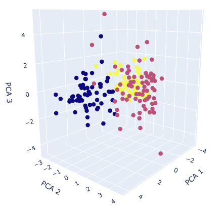
Finally, we visualize the dataset. We already obtained the 3 principal components, so it is a good choice to create the 3D scatter plot. To create the 3D scatter plot, we use plotly, one of the famous python libraries.
# import plotly.graph_objects as go

"""axis-label name"""
x_lbl, y_lbl, z_lbl = 'PCA 1', 'PCA 2', 'PCA 3'
"""data at eact axis to plot"""
x_plot, y_plot, z_plot = x_pca[:,0], x_pca[:,1], x_pca[:,2]

"""Create an object for 3d scatter"""
trace1 = go.Scatter3d(
    x=x_plot, y=y_plot, z=z_plot,
    mode='markers',
    marker=dict(
        size=5,
        color=y, # distinguish the class by color
        )
)
"""Create an object for graph layout"""
fig = go.Figure(data=[trace1])
fig.update_layout(scene = dict(
                    xaxis_title = x_lbl,
                    yaxis_title = y_lbl,
                    zaxis_title = z_lbl),
                    width=700,
                    margin=dict(r=20, b=10, l=10, t=10),
                    )
fig.show()
The colors correspond to the classification class. It can be seen from the graph that it is possible to roughly classify information-aggregated principal components.
If it is still difficult to classify after applying principal component analysis, the dataset may lack important features. Therefore, even if it is applied to the classification model, there is a high possibility that the accuracy will be insufficient. In this way, PCA helps us to consider the dataset by visualization.
Summary
We have seen how to perform PCA and visualize its results. One of the reasons to perform PCA is to consider the complexity of the dataset. When the PCA results are insufficient to classify, it is recommended to perform feature engineering.
The author hopes this blog helps readers a little.
Exploratory data analysis(EDA) is one of the most important processes in data analysis. To construct a machine-learning model adequately, understanding a dataset is important. Without appropriate EDA, there is no success. After the EDA, you will be able to effectively select models and perform feature engineering.
In this post, we use the wine classification dataset, one of the famous open datasets. We can easily use this dataset because it is already included in scikit-learn.
It’s very important to get used to working with open datasets. This is because, through an open dataset, we can quickly try out something new method we learned.
In the previous blog, the open dataset for regression analyses was introduced. This time, the author will introduce the open dataset that can be used for classification problems.
import numpy as np
import pandas as pd
from matplotlib import pyplot as plt
import seaborn as sns
from sklearn import preprocessing
from sklearn.model_selection import train_test_split
from sklearn.datasets import load_wine
dataset = load_wine()
Load the dataset
dataset = load_wine()
We can confirm the details of the dataset by the .DESCR method.
print(dataset.DESCR)


>> .. _wine_dataset:
>>
>> Wine recognition dataset
>> ------------------------
>>
>> **Data Set Characteristics:**
>>
>>     :Number of Instances: 178 (50 in each of three classes)
>>     :Number of Attributes: 13 numeric, predictive attributes and the class
>>     :Attribute Information:
>>  		- Alcohol
>>  		- Malic acid
>>  		- Ash
>> 		- Alcalinity of ash
>>  		- Magnesium>
>> 		- Total phenols
>>  		- Flavanoids
>>  		- Nonflavanoid phenols
>>  		- Proanthocyanins
>> 		- Color intensity
>>  		- Hue
>>  		- OD280/OD315 of diluted wines
>>  		- Proline
>>
>>      - class:
>>             - class_0
>>             - class_1
>>             - class_2
>>
>>     :Summary Statistics:
>>
>>     .
>>     .
>>     .
Confirm the content of the dataset
The contents of the dataset are stored in the variable “dataset”. In this variable, several kinds of information are stored, i.e., the target-variable name and values, the explanatory-variable names and values, and the description of the dataset. Then, we have to take each of them separately.
dataset.target_name: the class labels of the target variable dataset.target: values of the target variable (class label) dataset.feature_names: the explanatory-variable names dataset.data: the explanatory-variable values
We can take the class labels and those data in the target variable.
There are three classes in the target variables(‘class_0’ ‘class_1’ ‘class_2’). In other words, it can be understood that it is a problem of classifying wine into three categories from the explanatory variables.
You can see that the explanatory variables have multiple kinds. A description of each variable can be found in “dataset.DESCR”.
Convert the dataset into DataFrame in pandas
For convenience, we convert the dataset into the Pandas DataFrame type. With the DataFrame type, we can easily manipulate the table-type dataset and perform the preprocessing.
Here, let’s put all the data together into one Pandas DataFrame “df”.
Fortunately, there is no missing value! This fact is because this dataset is created carefully. Note that, however, there are usually many problems we have to deal with a real dataset.
Confirm the basic Descriptive Statistics values
We can calculate the basic descriptive statistics values with just 1 sentence!
Especially, it is worth to focus on “mean” and “std” as a first attention.
We can know the average from “mean” so that it makes it possible to judge a value is higher or lower. This feeling is important for a data scientist.
Next, “std” represents the standard deviation, which is an indicator of how much the data is scattered from “mean”. For example, “std” will be small if each value exists almost average.
It should be noted that the variance equals the square of the standard deviation, and the word “variance” may be more common for a data scientist. It is no exaggeration to say that the information in a dataset is contained in the variance. In other words, we cannot get any information if all values are the same. Therefore, it’s okay to delete the variable with zero variance.
Histogram Distribution
Data with variance is the data that is worth paying attention to. So let’s actually visualize the distribution of the data.
Seeing is believing!
We can perform the histogram plotting by “plt.hist()” in “matplotlib”, a famous library for visualization. The argument “bins” can control the fineness of plot.
for name in f.columns:
    plt.title(name)
    plt.hist(f[name], bins=50)
    plt.show()
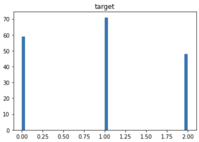
The distribution of the target variable is as follows. You can see that each category has almost the same amount of data. If the number of data is biased by category, you should pay attention to the decrease in accuracy due to imbalance.
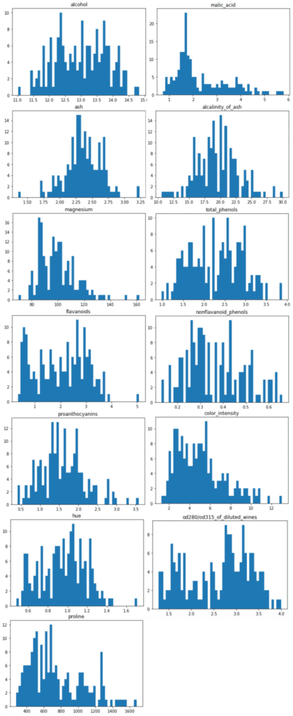
The distributions of the explanatory variables are below. We can see the difference in variance between the explanatory variables.
Summary
We have seen how to perform EDA briefly. The purpose of EDA is to properly identify the nature of the dataset. Proper EDA can make it possible to explore the next step effectively, e.g. feature engineering and modeling methods.
In the case of classification problems, principal component analysis can be considered as a deeper analysis method. I will introduce it in another post.
The machine learning approaches, such as decision-tree-based methods and linear regression, have been already introduced in other posts. These approaches are practical in real data science tasks.
However, deep learning approaches are also essential skills for a data scientist. In real, deep learning would be a more powerful approach when a dataset is larger than that of Boston house prices.
In this post, we will see a brief description of how to apply a neural network to the Boston house prices dataset.
from sklearn.datasets import load_boston
from sklearn import preprocessing
from sklearn.metrics import r2_score
import pandas as pd
import numpy as np
import matplotlib.pylab as plt
import seaborn as sns
sns.set()
import torch
import torch.nn as nn
import torch.nn.functional as F
import torch.optim as optim
Load the Dataset
In this post, we use the Boston house prices dataset in the scikit-learn library. We can easily load the dataset by just two lines below.
# from sklearn.datasets import load_boston
dataset = load_boston()
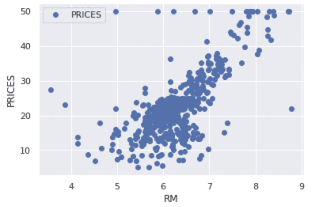
Let’s try to check the correlation between only “PRICES” and “RM”.
# import matplotlib.pylab as plt
f.plot(x="RM", y="PRICES", style="o")
plt.ylabel("PRICES")
plt.show()
Variables to be used
TargetName = "PRICES"
FeaturesName = [
              #-- "Crime occurrence rate per unit population by town"
              "CRIM",
              #-- "Percentage of 25000-squared-feet-area house"
              'ZN',
              #-- "Percentage of non-retail land area by town"
              'INDUS',
              #-- "Index for Charlse river: 0 is near, 1 is far"
              'CHAS',
              #-- "Nitrogen compound concentration"
              'NOX',
              #-- "Average number of rooms per residence"
              'RM',
              #-- "Percentage of buildings built before 1940"
              'AGE',
              #-- 'Weighted distance from five employment centers'
              "DIS",
              ##-- "Index for easy access to highway"
              'RAD',
              ##-- "Tax rate per $100,000"
              'TAX',
              ##-- "Percentage of students and teachers in each town"
              'PTRATIO',
              ##-- "1000(Bk - 0.63)^2, where Bk is the percentage of Black people"
              'B',
              ##-- "Percentage of low-class population"
              'LSTAT',
              ]
We prepare the input and target variables as “X” and “Y”.
X = f[FeaturesName]
Y = f[TargetName]
Standardize the Variables
We need to standardize or normalize the numerical variable in neural network analysis. This is because the magnitude of each variable affects its scale of parameters in a neural network. Therefore, the difference in the scale of the variables would make training of the model difficult.
From the above reason, we perform the standardization into the variables. In mathematically, the definition of the conversion of standardization is as follows.
To validate the performance of the trained model against unseen data, we have to split the dataset into the train data and the test data.
We pass the dataset “(X, Y)” to the “train_test_split()” function. The rate of the train data and the test data is defined by the argument “test_size”. Here, the rate is set to be “8:2”. And, “random_state” is set for reproducibility. You can use any number.
# from sklearn.model_selection import train_test_split
X_train, X_test, Y_train, Y_test = train_test_split(X_std, Y, test_size=0.2, random_state=99)
Define a Neural network model by PyTorch
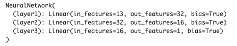
We define a neural network model. The model has three fully connected layers.
In “__init__()”, we define the layers we will use. For example, the first layer “self.layer1” has defined by “nn.Linear()” in PyTorch, where the input and output sizes are 13(X.shape[1]) and 32, respectively. Note that the input size 13 is automatically determined from the number of input variables in the dataset, whereas the output size is arbitrary and you have to decide. Similarly, in the second(third) layer, the input size has been automatically determined by the output size of the previous layer. In contrast, the output size is arbitrary and you have to decide. Namely, you can design the neural network structure by output sizes.
In “forward()”, we define the neural network structure. The input data is “x”. And, the “x” is passed into “self.layer1(x)”, where its output is given into the activation function “F.relu()”. Note that the output of the final(third) layer doesn’t have to be applied in the activation function. It is because the final-layer output is the predicted housing prices!
# import torch
# import torch.nn as nn
# import torch.nn.functional as F

class NeuralNetwork(nn.Module):
        def __init__(self):
            super(NeuralNetwork, self).__init__()
            self.layer1 = nn.Linear(X.shape[1], 32) # input: X.shape[1]=13, output: 32
            self.layer2 = nn.Linear(32, 16)
            self.layer3 = nn.Linear(16, 1)

        def forward(self, x):
            x = F.relu( self.layer1(x) )
            x = F.relu( self.layer2(x) )
            x = self.layer3(x)

            return x

model = NeuralNetwork()
print(model)
Convert data into a Tensor
In PyTorch, we have to explicitly convert the NumPy array(or pandas DataFrame) into a tensor. The conversion can be performed by “torch.tensor()”, where the param “type” is for specifying a data type.
It must be noted that the data shape of the prediction data will be (***, 1), whereas the data shape of “Y_train” is (***, ). These differences will cause the problem in calculating the loss in training. Therefore, we should reshape the data shape of “Y_train” before converting it into a tensor.
# Convert into tensor
x = torch.tensor(np.array(X_train), dtype=torch.float)
y = torch.tensor(np.array(Y_train).reshape(-1, 1), dtype=torch.float)
Define an Optimizer
We define an optimizer. PyTorch covers many optimization algorithms. The popular and basic ones are SGD and Adam.
Here, we choose the SGD algorithm as an optimizer.
# import torch.optim as optim
optimizer = optim.SGD(model.parameters(), lr=0.005)
We passed the two arguments “model.parameters()” and “lr=0.005”.
The first one is the parameters of the neural network model. The optimizer updates these parameters in each training cycle.
The second parameter is the learning rate. The learning rate is a parameter that indicates how much the model parameters are updated at once. Basically, gradually updating the parameters will surely lead to the optimum solution. On the other hand, it takes time to learn. Therefore, we need to think about the learning rate and find an appropriate value.
If you would like to use Adam as an optimizer, instead of the above codes, specify as follows.
We define a loss function. PyTorch covers many types of loss functions. Here, we use the mean squared error as a loss function.
# define loss function
loss_function = nn.MSELoss()
Train the Model
Finally, we can train the model !
At each epoch, we performs:
Initialize the gradient of the model parameters
Calculate the loss
Calculate the gradient of the model parameters by backpropagation
Update the model parameters
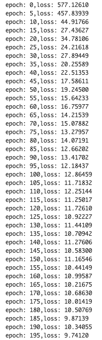
We set epochs as 200. Then, we repeat the above 200 times.
The loss would be gradually decreasing. It indicates that the training model is being well done !
# Epoch
epochs = 200

for i in range(epochs):
    # initialize the gradient of model parameters
    optimizer.zero_grad()

    # calculate the loss
    y_val = model(x)
    loss = loss_function(y_val, y)
    # Backpropagation
    loss.backward()
    # Update parameters
    optimizer.step()
    if (i % 5) == 0:
      print('epoch: {},'.format(i) + 'loss: {:.5f}'.format(loss))
Validation
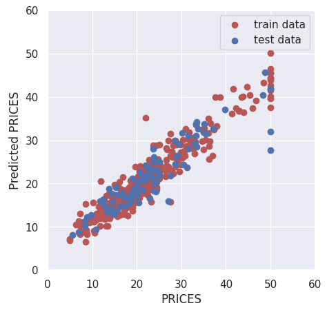
To validate the performance of the model, we predict the training and validation data. It should be noted here that we have to convert the tensor into the NumPy array after prediction.
We calculate $R^{2}$ score to confirm the prediction accuracy.
$R^{2}$ is the index for how much the model is fitted to the dataset. When $R^{2}$ is close to $1$, the model accuracy is good. Conversely, when $R^{2}$ approaches $0$, it means that the model accuracy is poor.
We can calculate $R^{2}$ by the “r2_score()” function in scikit-learn.
We have seen the Neural Network analysis constructed by PyTorch against the Boston house prices dataset. Although we use a very simple network structure, the accuracy of the validation data improved more than that of linear regression.
The author hopes this blog helps readers a little.
Streamlit makes it easier and faster to make your python script a web app. This means we can publish our codes as a web app!
In this post, we will see how to deploy our linear-regression-analysis code on a web app. In a web app format, we can try it in interactive. The origin of the linear regression analysis in this post is introduced in another post.
If the docker is available, you can use the Dockerfile in the following post, making it easy to prepare an environment for streamlit. Then, you can try the code in this post immediately.
The web app will be opened by the following command in the web browser.
$ streamlit run Boston_House_Prices.py
Import libraries
import streamlit as st
import numpy as np
import pandas as pd
import matplotlib.pyplot as plt
import seaborn as sns
sns.set()
from sklearn.datasets import load_boston
from sklearn import preprocessing
from sklearn.model_selection import train_test_split
from sklearn.linear_model import LinearRegression
from sklearn.metrics import r2_score
Title
You can create the title quickly by ‘st.title()’.
‘st.title()’: creates a title box
st.title('Linear regression on Boston house prices')
Load and Show the dataset
First, we load the dataset by ‘load_boston()’, and set it as pandas DataFrame by ‘pd.DataFame’.
Second, we assign the columns of the dataset and the target variable. The columns of the dataset are stored in ‘dataset.feature_names’. Similarly, the target variable is also stored in ‘dataset.target’.
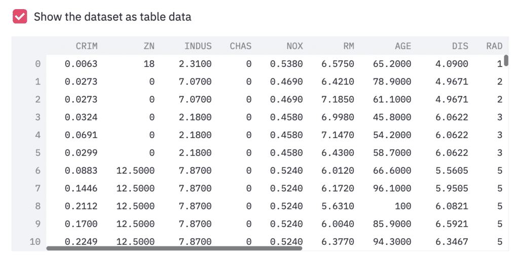
Third, we show the dataset as a table-data format, if we check the checkbox. The checkbox is create by ‘st.checkbox()’, and a table data is shown by ‘st.dataframe()’.
‘st.checkbox()’: creates a check box, which returns True when checked. ‘st.dataframe()’: display the data frame of the argument.
# Read the dataset
dataset = load_boston()
df = pd.DataFrame(dataset.data)
# Assign the columns into df
df.columns = dataset.feature_names
# Assign the target variable(house prices)
df["PRICES"] = dataset.target

# Show the table data
if st.checkbox('Show the dataset as table data'):
	st.dataframe(df)
For convenience, let’s create the box, where we can see a relationship between the target variable and the explanatory variables interactively.
‘st.checkbox()’: creates a check box, which returns True when checked. ‘st.selectbox()’: returns one element, we selected, from the argument.
# Check an exmple,  "Target" vs each variable
if st.checkbox('Show the relation between "Target" vs each variable'):
	checked_variable = st.selectbox(
		'Select one variable:',
		FeaturesName
		)
	# Plot
	fig, ax = plt.subplots(figsize=(5, 3))
	ax.scatter(x=df[checked_variable], y=df["PRICES"])
	plt.xlabel(checked_variable)
	plt.ylabel("PRICES")
	st.pyplot(fig)
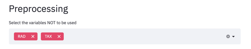
Preprocessing
Here, we select the variables we will NOT use. We define the list ‘FeaturesName’, including the names of the explanatory variables.
# Explanatory variable
FeaturesName = [\
              #-- "Crime occurrence rate per unit population by town"
              "CRIM",\
              #-- "Percentage of 25000-squared-feet-area house"
              'ZN',\
              #-- "Percentage of non-retail land area by town"
              'INDUS',\
              #-- "Index for Charlse river: 0 is near, 1 is far"
              'CHAS',\
              #-- "Nitrogen compound concentration"
              'NOX',\
              #-- "Average number of rooms per residence"
              'RM',\
              #-- "Percentage of buildings built before 1940"
              'AGE',\
              #-- 'Weighted distance from five employment centers'
              "DIS",\
              ##-- "Index for easy access to highway"
              'RAD',\
              ##-- "Tax rate per $100,000"
              'TAX',\
              ##-- "Percentage of students and teachers in each town"
              'PTRATIO',\
              ##-- "1000(Bk - 0.63)^2, where Bk is the percentage of Black people"
              'B',\
              ##-- "Percentage of low-class population"
              'LSTAT',\
              ]
In streamlit, the multi-selection is available by ‘st.multiselect()’. We pass the variables for multi-selections to ‘st.multiselect()’.
‘st.multiselect()’: returns the multi elements, we selected, from the argument.
"""
## Preprocessing
"""
# Select the variables NOT to be used
Features_chosen = []
Features_NonUsed = st.multiselect(
	'Select the variables NOT to be used',
	FeaturesName)
Multiple selected variables are stored in ‘Features_NonUsed’, which will NOT be used. Let’s remove this unused variable from the dataset ‘df’.
df = df.drop(columns=Features_NonUsed)
NOTE: Markdown
Here, it should be noted about ‘Markdown’. The markdown style is useful! For example, the following comment outed statement is shown in web app as follows. With the markdown style, we can easily display the statement.
"""
# Markdown 1
## Markdown 2
### Markdown 3
"""
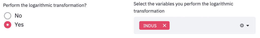
Next, as preprocessing, logarithmic conversion and standardization are performed. For logarithmic transformation, we select the variables that will be performed. On the other hand, for standardization, we take the form of selecting variables that won’t be performed.
The corresponding part of the code related to logarithmic conversion is as follows.
‘st.beta_columns(2)’: creates 2 columns ‘.radio()’: Put a box to select one from an argument.
left_column, right_column = st.beta_columns(2)
bool_log = left_column.radio(
			'Perform the logarithmic transformation?',
			('No','Yes')
			)

df_log, Log_Features = df.copy(), []
if bool_log == 'Yes':
	Log_Features = right_column.multiselect(
					'Select the variables you perform the logarithmic transformation',
					df.columns
					)
	# Perform logarithmic transformation
	df_log[Log_Features] = np.log(df_log[Log_Features])
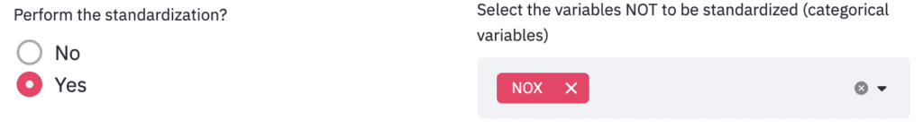
And, the corresponding part of the code related to standardization is as follows.
left_column, right_column = st.beta_columns(2)
bool_std = left_column.radio(
			'Perform the standardization?',
			('No','Yes')
			)

df_std = df_log.copy()
if bool_std == 'Yes':
	Std_Features_chosen = []
	Std_Features_NonUsed = right_column.multiselect(
					'Select the variables NOT to be standardized (categorical variables)',
					df_log.drop(columns=["PRICES"]).columns
					)
	for name in df_log.drop(columns=["PRICES"]).columns:
		if name in Std_Features_NonUsed:
			continue
		else:
			Std_Features_chosen.append(name)
	# Perform standardization
	sscaler = preprocessing.StandardScaler()
	sscaler.fit(df_std[Std_Features_chosen])
	df_std[Std_Features_chosen] = sscaler.transform(df_std[Std_Features_chosen])
Split the dataset
To validate the model, we split the dataset into training and validation datasets. Interactively get information and split the dataset. Concretely, we put the boxes of the validation dataset size and the random seed.
Here, we use the following functions.
‘st.beta_columns(2)’: creates 2 columns ‘.number_input()’: Add a detail info to ‘st.beta_columns()’
Here, predict the training and validation data. Note that we have to perform logarithmic conversion against the variable we appointed.
Y_pred_train = regressor.predict(X_train)
Y_pred_val = regressor.predict(X_val)

# Inverse logarithmic transformation if necessary
if "PRICES" in Log_Features:
	Y_pred_train, Y_pred_val = np.exp(Y_pred_train), np.exp(Y_pred_val)
	Y_train, Y_val = np.exp(Y_train), np.exp(Y_val)
Here we use the R2 value as a validation indicator. Let’s calculate R2 of the validation dataset and display it in streamlit. You can easily do it with’st.write’.
"""
## Show the result
### Check R2 socre
"""
R2 = r2_score(Y_val, Y_pred_val)
st.write(f'R2 score: {R2:.2f}')
Plot
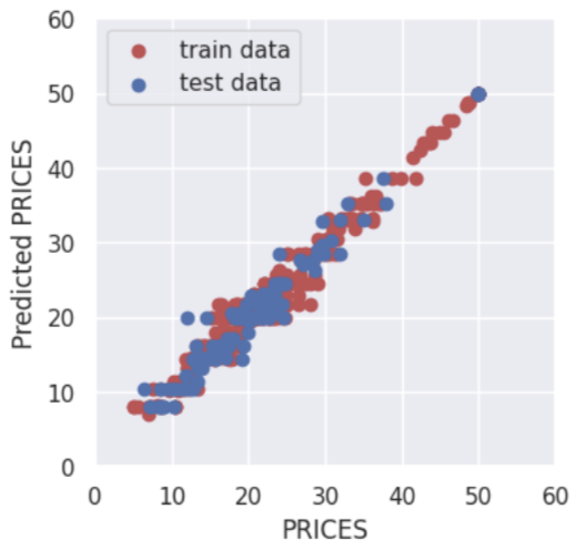
Finally, let’s output the result. Design the display settings for training data and verification data to be interactive. It is also designed to be able to interactively change the value range for the axes of the graph in the same way.
"""
### Plot the result
"""
left_column, right_column = st.beta_columns(2)
show_train = left_column.radio(
				'Show the training dataset:',
				('Yes','No')
				)
show_val = right_column.radio(
				'Show the validation dataset:',
				('Yes','No')
				)

# default axis range
y_max_train = max([max(Y_train), max(Y_pred_train)])
y_max_val = max([max(Y_val), max(Y_pred_val)])
y_max = int(max([y_max_train, y_max_val]))

# interactive axis range
left_column, right_column = st.beta_columns(2)
x_min = left_column.number_input('x_min:',value=0,step=1)
x_max = right_column.number_input('x_max:',value=y_max,step=1)
left_column, right_column = st.beta_columns(2)
y_min = left_column.number_input('y_min:',value=0,step=1)
y_max = right_column.number_input('y_max:',value=y_max,step=1)


fig = plt.figure(figsize=(3, 3))
if show_train == 'Yes':
	plt.scatter(Y_train, Y_pred_train,lw=0.1,color="r",label="training data")
if show_val == 'Yes':
	plt.scatter(Y_val, Y_pred_val,lw=0.1,color="b",label="validation data")
plt.xlabel("PRICES",fontsize=8)
plt.ylabel("PRICES of prediction",fontsize=8)
plt.xlim(int(x_min), int(x_max)+5)
plt.ylim(int(y_min), int(y_max)+5)
plt.legend(fontsize=6)
plt.tick_params(labelsize=6)
st.pyplot(fig)